Warm Autumn Color Palette
Golden, spicy and earthy: the warmest palette in the Autumn family.
Warm Autumn is the golden, spice-toned palette: rust, olive, mustard, pumpkin and warm brown. It leans clearly warm, sits at medium-deep on the lightness scale, and is moderately muted, meaning the colors are rich but have an earthy softness rather than a neon sparkle. Contrast is medium. If the other Autumn palettes are defined by softness or depth, this one is defined by warmth itself: nearly every color has a gold or orange thread running through it.
- Temperature: clearly warm
- Depth: medium-deep
- Clarity: muted
- Contrast: medium
It belongs to the Autumn color season, one of three Autumn subtypes in the twelve-season map used on this site.
Warm Autumn colors: 14 named shades
The next fourteen shades are named examples. Hex codes are approximate on a screen, so judge by the names and compare with real fabrics, paint chips or leaves outside your window.
- Rust
- Olive Green
- Mustard
- Pumpkin
- Teal Moss
- Terracotta Red
- Warm Cream
- Chestnut
- Khaki
- Coffee Brown
- Amber
- Brick Orange
- Peacock Green
- Saffron
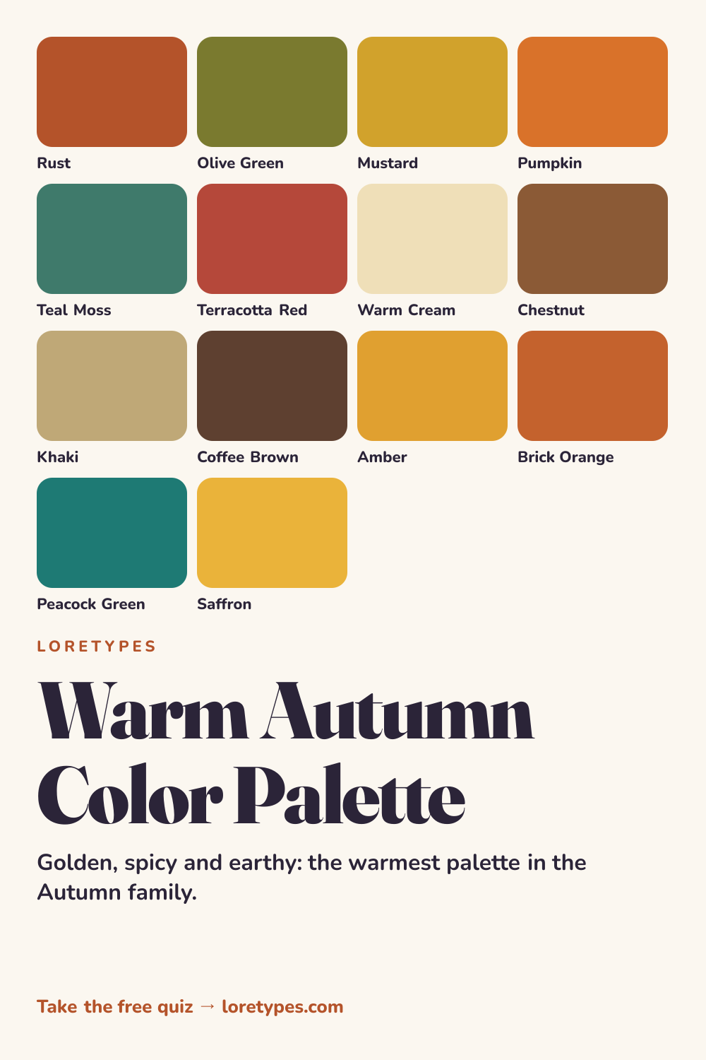
Best colors for Warm Autumn
Start with rust, olive green, mustard and pumpkin, which together look like a hillside in October. Each of them has golden warmth built in, and each is saturated enough to feel rich without looking synthetic.
Teal moss and terracotta red balance the group. The teal is a cooler-looking shade that nonetheless carries green-gold in its base, so it sits with the others instead of competing. The terracotta is a redder cousin of rust and works well as a statement item.
You will notice that none of these colors is pale. If a shade looks pastel or icy, it probably belongs elsewhere; if it looks like something you could find in a spice rack or a pile of leaves, it probably belongs here.
Warm Autumn neutrals
Neutrals follow the warm brown family: warm cream, khaki, chestnut and coffee brown. Brown does the work that black does in other palettes, giving depth without a cold edge. Cream stands in for white, with a hint of yellow that suits the rest of the colors.
If you want a darker neutral, choose coffee brown or a dark olive instead of black. A coffee brown belt, boots or coat can anchor the whole look.
Warm Autumn accent colors
Accent shades are the brightest the palette gets: amber, brick orange, peacock green and saffron. They are the colors for earrings, scarves, mugs, a pop of lining or a pair of shoes. Even at their strongest they keep a golden quality.
Peacock green is the quiet star. It adds depth and a hint of coolness without leaving the family, so it pairs well with every warm neutral listed above.
Using Warm Autumn colors day to day
Warm Autumn clothes are at their most natural in textured fabrics such as wool, corduroy, suede and linen, where the earthy character of the colors gets reinforced by the material itself. A chestnut jacket over a cream sweater and olive trousers is a standard weekend look, while a rust or mustard top turns it livelier.
For work, use khaki or chestnut as the main color and bring in one jewel-like shade, such as peacock green, in a shirt or a scarf. That combination has structure and still feels warm. A practical tip is to lay everything you own out by color family once, then discard nothing but notice which warm shades appear most often; that cluster is your working core.
Colors to use sparingly
Icy, pastel or cool-leaning colors typically look detached from this palette. Each has a warm stand-in that keeps the same function.
- Icy Blue. A cold pale blue has no gold in it and feels brittle beside rust and olive. Peacock green offers cool-ish contrast within the family.
- Fuchsia. Blue-based hot pink overpowers earthy tones. Terracotta red or brick orange keeps the energy in a warm form.
- Pure White. Stark white looks flat next to warm colors. Warm cream is the natural replacement.
- Silver Gray. Cool gray fights the golden base. Khaki or soft chestnut take over the neutral role more comfortably.
Warm Autumn color combinations
Here are four combinations to consider, described by family so that you can match them to your own pieces.
Wardrobe
A warm cream sweater, olive trousers and a chestnut jacket form a reliable base. Replace the sweater with a rust knit for a stronger autumn look.
Accessories
Gold or brass-toned metal, a coffee brown leather bag and a mustard scarf bring the palette together. Wooden and tortoiseshell-style details feel natural here.
Makeup colors
Look for terracotta, warm brown, copper and brick-orange families in satin or soft matte finishes. Names with "spice", "clay" or "bronze" tend to be on the right track.
Home and desk
Warm cream walls, a rust throw and an olive plant pot are a classic combination. Use a peacock green cushion to give the room some depth.
Warm Autumn vs Soft Autumn and Deep Autumn
| Aspect | Warm Autumn | Soft Autumn | Deep Autumn |
|---|---|---|---|
| Temperature | Clearly warm; golden | Gently warm; mellow | Warm with a deeper, redder cast |
| Depth | Medium-deep | Medium | Deep |
| Clarity | Moderately muted; earthy but rich | Heavily muted; dusty | Muted, dark and rich |
| Typical neutral | Khaki, chestnut, coffee brown | Oatmeal, warm taupe, mushroom | Espresso, dark olive, warm charcoal |
| Common mix-up | A rust that turns brown loses the glow | A sage that turns bright feels loud | A forest that turns black loses warmth |
Soft Autumn is the neighbor on the gentler side. It uses the same family of colors but dials down their saturation, so sage replaces olive and clay rose replaces terracotta. If your favorites look like faded versions of rust and mustard, you are probably closer to Soft Autumn.
Deep Autumn sits on the dark side. It shares the warmth but adds depth, with espresso, forest green and copper where Warm Autumn has chestnut, olive and rust. Holding a chestnut item and an espresso item against your favorites is a practical way to decide.
A small experiment with Warm Autumn colors
Collect three items in warm earth colors, for instance a rust item, an olive item and a cream item. Put them on a table together and look at the overall mood. Then add a pure white or icy blue item and see how it changes the feel.
Try the same thing with metals: hold a gold chain and a silver chain next to the pile and note which one blends more easily. Keep a written list of the combinations you reached for again, because those habits are the real data.
This site's quiz works from your palette preferences, not from a photo analysis. This quiz explores palette preferences. It does not measure your skin tone or physical features, and its result is a starting point for trying colors you enjoy.
Find my starting palette →Warm Autumn color palette FAQ
What is the Warm Autumn color palette?
It is a set of rich, golden, earthy colors from the Autumn family, including rust, olive green, mustard, pumpkin and chestnut. It is the warmest of the Autumn subtypes, with medium-deep tones and a spicy, textured character.
What are the best colors for Warm Autumn?
Rust, olive green, mustard, pumpkin, teal moss and terracotta red form the core. Warm cream, khaki, chestnut and coffee brown are neutrals, and amber, brick orange, peacock green and saffron are strong accent choices.
What colors should Warm Autumn avoid?
Cool and icy shades, such as icy blue, fuchsia, pure white and silver gray, generally look detached from the golden palette. They can be used in small amounts, or swapped for warm cream, terracotta red, peacock green or khaki.
What is the difference between Warm Autumn and Deep Autumn?
Both are warm. Warm Autumn is medium-deep and golden, with rust, mustard and olive, while Deep Autumn is darker and richer, with espresso, forest green and copper. Compare a chestnut item and an espresso item to see which looks more natural to you.
Can the Loretypes quiz suggest Warm Autumn?
Yes, as a starting idea. If your answers favor warm, rich, earthy combinations, the quiz may point to Warm Autumn. It relies on palette preferences, not photos or physical features, so use the result as something to try on a few items.
More color season palettes
- Autumn color season
- Soft Autumn color palette
- Soft Summer color palette
- Warm Spring color palette
- Bright Spring color palette
- Deep Winter color palette
- Deep Autumn color palette
- Light Spring color palette
- Light Summer color palette
- Cool Summer color palette
- Cool Winter color palette
- Bright Winter color palette
- 16 seasonal color analysis