Bright Winter Color Palette
Vivid, electric and high in contrast: the loudest palette on the map.
Bright Winter is the most vivid palette in the twelve-season map, built from saturated jewel colors set against black and white: fuchsia, cobalt, emerald, true red and hot turquoise. It leans slightly cool, sits at medium-deep on lightness, and has the highest clarity of any subtype. Contrast is as high as it goes, because the colors are clean and strong and the neutrals are at the extremes. Nothing in it is dusty, soft or hazy.
- Temperature: cool-leaning
- Depth: medium-deep
- Clarity: very clear
- Contrast: high
It belongs to the Winter color season, one of three Winter subtypes in the twelve-season map used on this site.
Bright Winter colors: 14 named shades
These fourteen named shades show what intensity means in practice. Saturated colors display well on screens, but the exact brightness will vary, so check them against real fabrics.
- Fuchsia
- Vivid Cobalt
- Emerald
- True Red
- Hot Turquoise
- Electric Violet
- Black
- Optic White
- Charcoal Navy
- Cool Silver
- Lemon Sorbet
- Shocking Pink
- Lime Ice
- Sky Blue
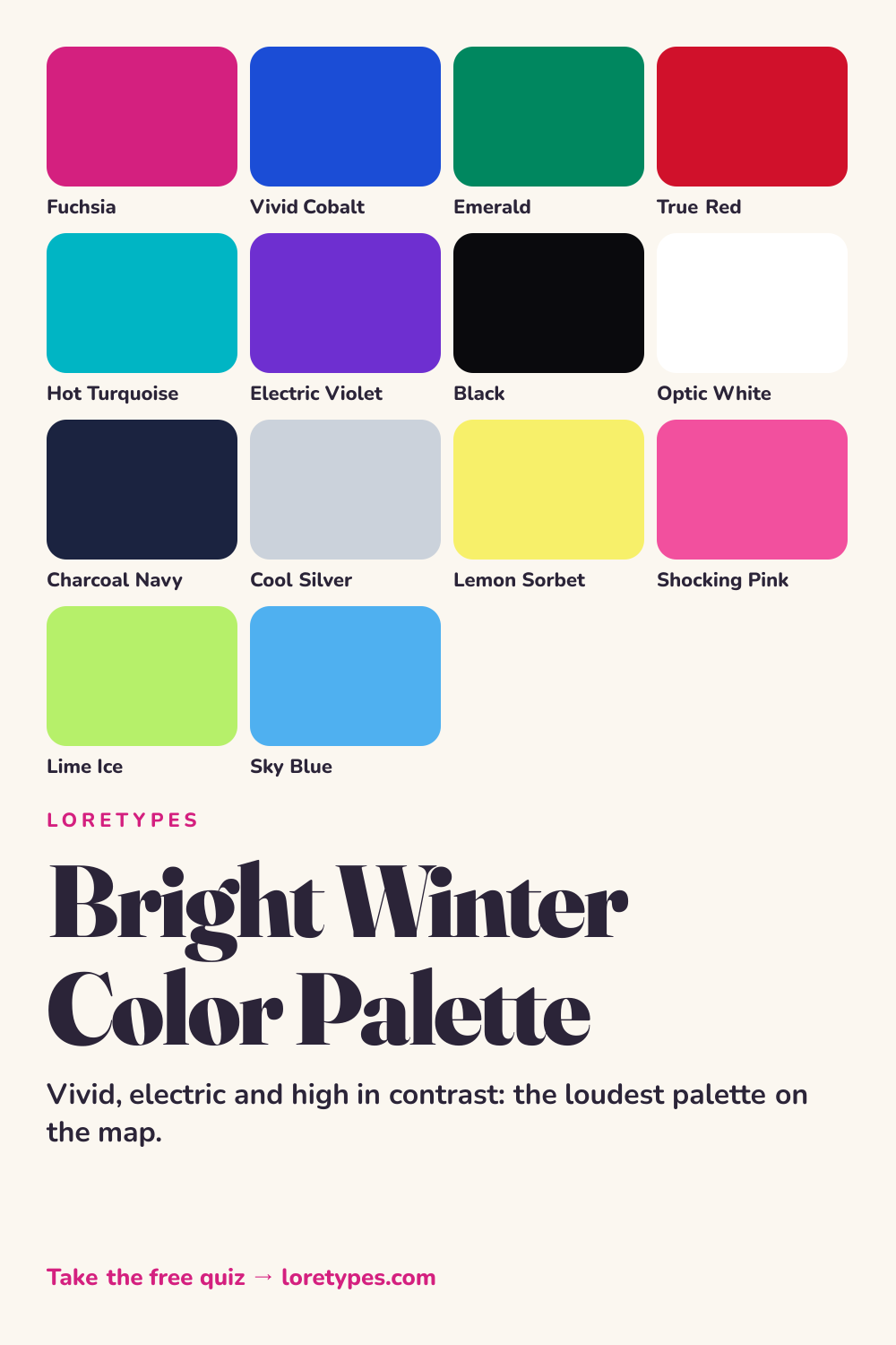
Best colors for Bright Winter
Fuchsia, vivid cobalt, emerald and true red are the center of the palette. They are the kinds of colors that would still look vivid under poor light, and they hold their own beside each other because each is equally strong. This is the family to turn to for statement coats, dresses or a single bold piece.
Hot turquoise and electric violet widen the range. Turquoise is a clear blue-green with real zing, and violet adds a jewel-like depth. Neither one is pale or tentative.
The simplest test for any color is to ask whether it looks clean. If it seems cloudy, chalky or earthy, it is probably not Bright Winter. If it seems like it was colored in with a fresh marker, it likely is.
Bright Winter neutrals
Neutrals are the extremes: black and optic white, with charcoal navy and cool silver in between when needed. Black and white together are a natural fit, not a harsh one, since they match the strength of the colors. A black outfit with a single fuchsia piece is a textbook example.
Avoid soft neutrals in the middle, such as beige, stone or taupe. They sit between the extremes and tend to look like an afterthought beside such clean colors.
Bright Winter accent colors
Accents go even brighter: lemon sorbet, shocking pink, lime ice and sky blue. These are sorbet-like and a little playful, and they work best in small amounts, such as socks, a phone case, a bracelet or a lipstick shade.
Pairing a sorbet accent with black is a low-risk move. Lime ice against a black jacket, or lemon sorbet on a charcoal navy sweater, creates energy without making the whole look chaotic.
Using Bright Winter colors day to day
In practice, this palette works through contrast. A black blazer over an optic white shirt with cobalt trousers is a strong, simple start, and a fuchsia scarf or true red bag turns it up another notch. For everyday wear, one saturated color paired with black or white is enough; there is no need to mix several bright shades at once.
Many people with these preferences find that muted colors feel dull on them in practice, so they tend to reach for color blocks rather than blends. If a full-color look feels like too much, begin with a single vivid item and keep everything else black, white or navy. Over time you can add a second vivid color and see whether it reads as lively or just loud.
Colors to use sparingly
Dusty, muted and earthy colors blunt the sharpness that defines this palette. Each one listed has a cleaner substitute.
- Dusty Sage. Grayed green looks flat beside emerald and cobalt. Emerald or lime ice brings the green family back at full strength.
- Camel. A soft golden brown has no sparkle. Charcoal navy gives a neutral with a cleaner edge.
- Mushroom. A muted taupe fades into the background. Cool silver offers a clear, light neutral instead.
- Dusty Rose. A smoky pink dulls the surrounding colors. Fuchsia or shocking pink gives the same family with energy.
Bright Winter color combinations
Bright combinations are about contrast and clarity. These four examples show how to use them without overload.
Wardrobe
A black jacket, an optic white tee and cobalt trousers form a graphic base. Add a fuchsia bag, and the outfit has a clear focal point.
Accessories
Silver or white-gold-toned metal, a black leather bag and one true red or hot turquoise accessory work well. Glossy finishes suit the palette better than matte ones.
Makeup colors
Search by family: true red, fuchsia, hot pink and bright berry in clean, saturated finishes. Beige-pink and brown-toned nudes are rarely what this mood is asking for.
Home and desk
White walls, a black desk and an electric violet chair make a graphic room. A hot turquoise vase or lime ice notebook adds a quick spark.
Bright Winter vs Bright Spring and Cool Winter
| Aspect | Bright Winter | Bright Spring | Cool Winter |
|---|---|---|---|
| Intensity | Maximum; electric and glossy | Bright and warm; fresh | Crisp and icy; slightly softer |
| Temperature | Slightly cool | Slightly warm | Clearly cool |
| Contrast | Very high; black and white anchors | Medium-high; cream and light colors | High; navy and white anchors |
| Typical neutral | Black, optic white, charcoal navy | Cream, light camel, warm gray | Navy, steel gray, pure white |
| Common mix-up | A pink that turns coral loses the electricity | A coral that turns pink feels too cool | A cobalt that turns gray feels too reserved |
Bright Spring is the neighbor on the warm side. It has the same clean, lively saturation, but its colors swing toward coral, turquoise and lemon with cream in place of white. If a coral red feels more natural to you than a blue red, Bright Spring is closer.
Cool Winter is the neighbor on the icy side. It shares the crispness but gives up some of the extra voltage, preferring cobalt and cool berry to fuchsia and hot turquoise. Holding a vivid fuchsia item and a cool berry item against your favorites is a practical way to compare.
A small experiment with Bright Winter colors
Set a black item and an optic white item side by side, then add a vivid fuchsia or cobalt item. Look at the energy of the trio in daylight. Replace the vivid item with a dusty pink or beige one and see what disappears.
Do this once more with a bright accent against a muted accent. Keep a short list of the combinations that made you want to keep looking, and those that you liked less after a day. That log will be more helpful than the name of any palette.
This site's quiz works from your palette preferences, not from a photo analysis. This quiz explores palette preferences. It does not measure your skin tone or physical features, and its result is a starting point for trying colors you enjoy.
Find my starting palette →Bright Winter color palette FAQ
What is the Bright Winter color palette?
It is a vivid, high-contrast set of colors from the Winter family, including fuchsia, vivid cobalt, emerald, true red and hot turquoise, usually paired with black and white. It has the highest clarity of the twelve subtypes.
What are the best colors for Bright Winter?
Fuchsia, vivid cobalt, emerald, true red, hot turquoise and electric violet are the core. Black, optic white, charcoal navy and cool silver are neutrals, and lemon sorbet, shocking pink, lime ice and sky blue are good accents.
What colors should Bright Winter avoid?
Dusty, earthy and soft shades such as dusty sage, camel, mushroom and dusty rose tend to look flat against vivid colors. You can still use them in small amounts, or switch to a cleaner relative like emerald, charcoal navy, cool silver or fuchsia.
What is the difference between Bright Winter and Bright Spring?
Both are vivid. Bright Winter leans slightly cool and uses black and white, with fuchsia and cobalt, while Bright Spring leans slightly warm and uses cream, with coral and turquoise. Compare a fuchsia item with a coral item to see which feels like your pile.
Can the Loretypes quiz suggest Bright Winter?
It can offer Bright Winter as a starting point if your answers favor vivid, clear, high-contrast combinations. The quiz uses stated palette preferences with no photos or physical features, so the result is a palette to test on clothes you own.
More color season palettes
- Winter color season
- Soft Autumn color palette
- Soft Summer color palette
- Warm Spring color palette
- Bright Spring color palette
- Deep Winter color palette
- Deep Autumn color palette
- Light Spring color palette
- Light Summer color palette
- Cool Summer color palette
- Warm Autumn color palette
- Cool Winter color palette
- 16 seasonal color analysis