Light Spring Color Palette
Pale, warm-leaning and clear: colors that look like morning light on a table.
Light Spring is the palette made of pale, fresh, slightly warm colors: peach, buttercream, pale aqua, soft coral and a light leaf green. Placed on the dimensions that define the twelve-season map, it is the lightest of all twelve subtypes, it leans a little toward warmth rather than coolness, and its colors are clear instead of dusty. Contrast stays gentle, so nothing in the palette is dark enough to dominate the others. Think of watercolor washes rather than ink.
- Temperature: warm-leaning
- Depth: light
- Clarity: clear
- Contrast: low
It belongs to the Spring color season, one of three Spring subtypes in the twelve-season map used on this site.
Light Spring colors: 14 named shades
Here are fourteen named shades that express the idea. Light colors are the ones screens distort most, so treat the names as the main guide and the hex codes as a rough sketch to compare against fabric or paint in daylight.
- Peach Cream
- Pale Aqua
- Soft Coral
- Spring Leaf
- Butter Yellow
- Light Periwinkle
- Ivory
- Light Camel
- Warm Dove
- Pale Honey
- Salmon Pink
- Fresh Mint
- Warm Turquoise
- Apricot Gold
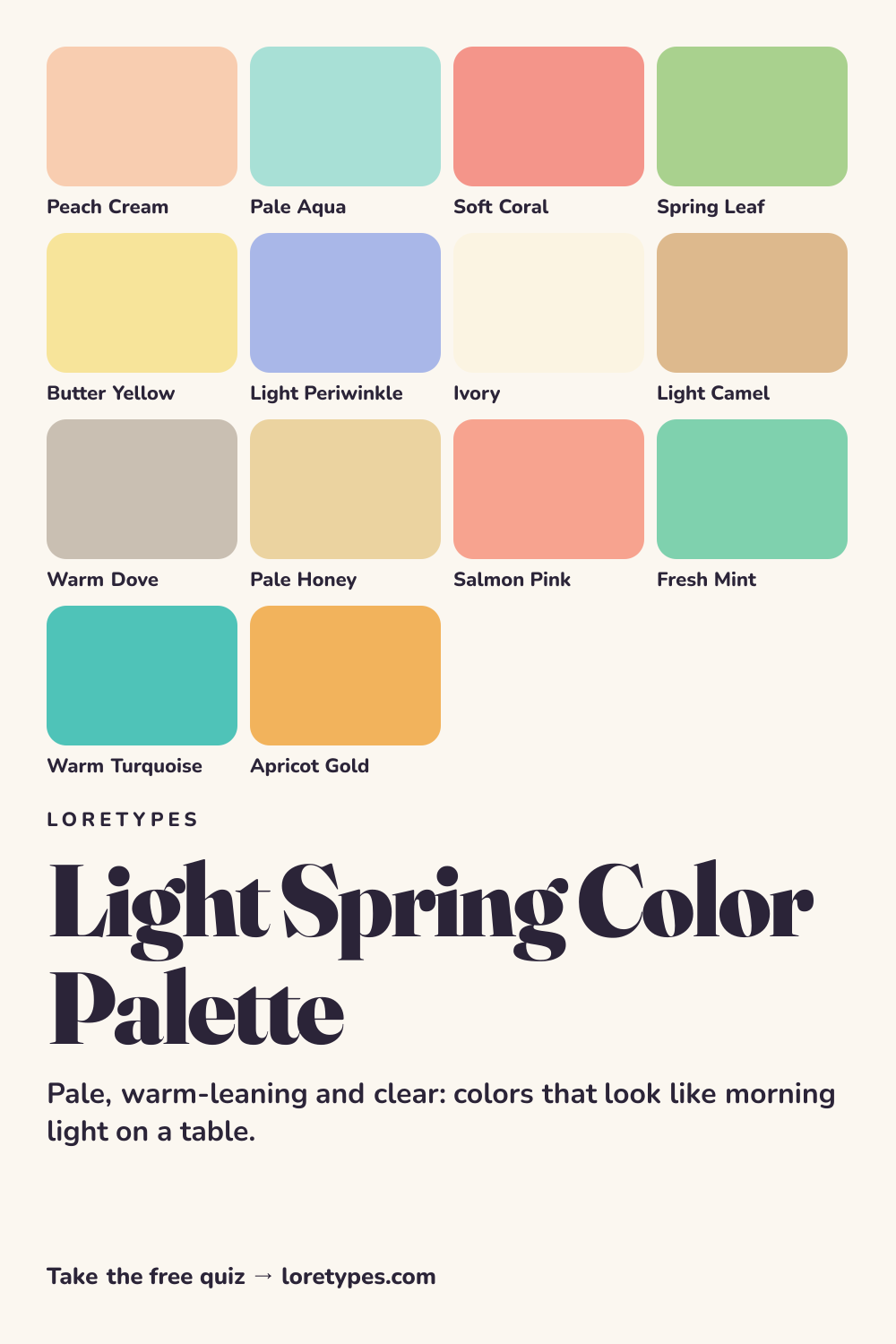
Best colors for Light Spring
What unites the core colors is lightness with a bit of sunshine in it. Peach cream, butter yellow and spring leaf all look like a light source is behind them. Soft coral and pale aqua give the palette a pair of opposites, one warm and one watery, that can sit side by side without either becoming heavy.
Light periwinkle is the quiet surprise. It is the coolest of the core shades, yet it stays pale and clear, so it adds variety to a wardrobe that might otherwise be all peach and cream. A periwinkle shirt with ivory trousers is easy to picture and easy to wear.
A useful test for any new color is whether it could be described with the word "pale" or "fresh". If the honest description is "deep" or "smoky", the color probably belongs in another palette.
Light Spring neutrals
Neutrals in this palette are warm and light: ivory, pale honey, light camel and a warm dove gray. They are noticeably softer than the black, navy and charcoal found in other families. Ivory takes the place of white, and light camel takes the place of brown, which keeps the whole outfit in the same pale range.
If you want a darker anchor, choose a mid-tone such as light camel rather than a true dark. A camel belt or bag grounds an airy outfit without turning it into a different palette.
Light Spring accent colors
Accent colors here are lively but never heavy: salmon pink, fresh mint, warm turquoise and apricot gold. They exist to add a little more energy than the base colors, and they are best used in small amounts such as a scarf, a pair of earrings, a mug or a book cover.
Warm turquoise is the most versatile of the four, because it works with every neutral in the palette and lifts peach, coral and butter yellow alike.
Using Light Spring colors day to day
A Light Spring week can be built from very few items. Ivory trousers, a peach cream blouse, a pale aqua cardigan and a light camel bag already make several combinations, and each piece keeps the same airy feeling. Because the colors are close in weight, putting two of them together rarely goes wrong.
When something feels too sweet, add one slightly stronger element from the accent group, such as warm turquoise or apricot gold. That is the most reliable way to give the palette some backbone without leaving it. Shopping is easiest if you carry a small swatch card with you and check each candidate against it before you commit.
Colors to use sparingly
A few kinds of colors tend to overpower the lightness that defines this palette. They are fine in tiny doses, and each has a lighter stand-in.
- Jet Black. Black is the heaviest option available and pulls attention away from pale shades. Light camel or warm dove is a far friendlier base.
- Burgundy. A dark wine shade creates a stark gap with the surrounding pastels. Soft coral or salmon pink holds a similar red idea at a lighter weight.
- Charcoal Gray. Dark cool gray feels severe beside peach and aqua. Warm dove gray provides the same neutral job more softly.
- Forest Green. A deep green absorbs the light colors around it. Spring leaf or fresh mint carries the green family at a fresher level.
Light Spring color combinations
These pairings are described in color families so that you can match them to what you already own.
Wardrobe
Ivory trousers, a peach cream top and a pale aqua jacket form a bright, easy trio. Swap the top for butter yellow when the weather warms up.
Accessories
Light gold or champagne-toned metal, a light camel bag and a salmon pink scarf finish a pale outfit without adding weight. A warm turquoise bracelet is a good single note.
Makeup colors
Search by family: peach, apricot, coral and warm pink in sheer or glossy finishes. Heavy, dark berry shades are the opposite of the palette, while light, translucent washes match it.
Home and desk
A pale honey wall, ivory curtains and a mint-colored vase make a sunny room. Add a periwinkle cushion if the space needs a cooler corner.
Light Spring vs Warm Spring and Light Summer
| Aspect | Light Spring | Warm Spring | Light Summer |
|---|---|---|---|
| Lightness | Lightest of the twelve; airy | Medium-light; richer than pastel | Very light but cooler and softer |
| Temperature | Slightly warm; sunny | Strongly warm; golden | Slightly cool; rosy and powdery |
| Clarity | Clear and fresh | Clear with more saturation | Hazy and gently muted |
| Typical neutral | Ivory, light camel, warm dove | Cream, golden tan, warm khaki | Soft white, pale gray, cool beige |
| Common mix-up | A peach that turns orange loses the airiness | A yellow that turns pale lemon feels too cool | A pink that turns apricot feels too warm |
Warm Spring is the neighbor on the warm side. It keeps the sunny feeling but turns up the saturation and the depth, so golden tan, bright leaf green and orange-leaning coral appear. If your favorite colors look like the fresh, pale version of those shades, Light Spring is the better guide.
Light Summer shares the lightness but moves toward cool and powdery. Where Light Spring says peach and mint, Light Summer says rose and powder blue. A short comparison helps: hold a pale peach and a pale pink next to your favorite lightweight sweater and notice which feels more at home.
A small experiment with Light Spring colors
Gather three light objects from around the house, such as a peach or yellow item, a pale blue-green item and something ivory. Place them together on a windowsill and see whether they feel like one gentle family or like a clash of pastels.
Then introduce a dark object, for example a black notebook, into the group and note how quickly the mood changes. Write down which version you would rather look at for a whole afternoon. That note is more informative than any label.
This site's quiz works from your palette preferences, not from a photo analysis. This quiz explores palette preferences. It does not measure your skin tone or physical features, and its result is a starting point for trying colors you enjoy.
Find my starting palette →Light Spring color palette FAQ
What is the Light Spring color palette?
It is a group of pale, fresh, slightly warm colors from the Spring family, such as peach cream, pale aqua, soft coral, butter yellow and spring leaf. The shared quality is lightness: nothing in the palette is dark enough to dominate the rest.
What are the best colors for Light Spring?
Peach cream, pale aqua, soft coral, spring leaf, butter yellow and light periwinkle make up the core. Ivory, pale honey, light camel and warm dove are the usual neutrals, and salmon pink, fresh mint and warm turquoise work as accents.
What colors should Light Spring avoid?
Very dark and heavy shades, such as jet black, burgundy, charcoal and forest green, can overwhelm a light palette. They are not forbidden; use them in very small amounts or choose a lighter relative like light camel or fresh mint.
What is the difference between Light Spring and Light Summer?
Both are pale. Light Spring leans slightly warm and clear, with peach, mint and butter yellow, while Light Summer leans slightly cool and powdery, with rose, powder blue and lavender. Compare a pale peach to a pale pink to see which feels closer to your favorites.
Can the Loretypes quiz suggest Light Spring?
Yes, as a starting idea. If your answers favor light, warm-leaning, clear combinations, the quiz may point to Light Spring. It works from palette preferences only, not from photos or physical features, so treat the result as something to try on a few items.
More color season palettes
- Spring color season
- Soft Autumn color palette
- Soft Summer color palette
- Warm Spring color palette
- Bright Spring color palette
- Deep Winter color palette
- Deep Autumn color palette
- Light Summer color palette
- Cool Summer color palette
- Warm Autumn color palette
- Cool Winter color palette
- Bright Winter color palette
- 16 seasonal color analysis