Soft Summer Color Palette
Cool-leaning, hazy and blended: colors with a little gray stirred into every one.
Soft Summer is the hazy, cool-leaning member of the Summer family. Placed on the main dimensions, it tilts slightly cool rather than icy, lands in the middle on depth, and sits at the muted end of clarity, so each shade looks as if a little smoke gray has been mixed in. Contrast stays low, which is why a Soft Summer palette feels like a watercolor wash: rose melts into mauve, mauve into slate, slate into gray-green.
- Temperature: cool-leaning
- Depth: medium
- Clarity: very muted
- Contrast: very low
It belongs to the Summer color season, one of three Summer subtypes in the twelve-season map used on this site.
Soft Summer colors: 14 named shades
The swatches below name fourteen examples worth testing against fabrics, paper or paint you already have. Monitors vary, so rely on the color names as much as the hex codes.
- Dusty Rose
- Faded Denim
- Gray Green
- Heather
- Muted Mauve
- Slate Blue
- Cool Taupe
- Soft Charcoal
- Pearl Gray
- Rose Beige
- Soft Raspberry
- Muted Teal
- Dusty Plum
- Periwinkle Gray
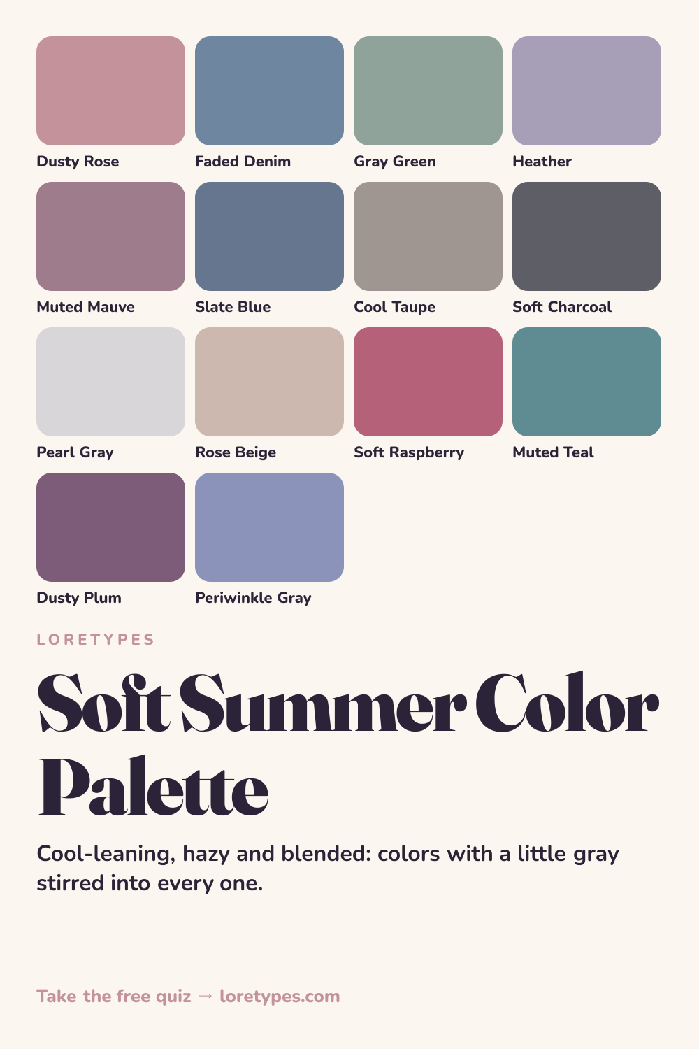
Best colors for Soft Summer
Look for shades that seem pre-mixed with gray: dusty rose rather than hot pink, faded denim rather than royal blue, gray-green rather than kelly green. The six core colors here live in the same medium range of lightness, which lets you combine almost any two of them without a jolt.
Heather and muted mauve are the quiet stars. They add a purple-leaning softness that rounds out the blues and greens, and they look natural in knitwear, in stationery and in the cooler shades of a spring wardrobe that has to survive a gray commute.
Soft Summer neutrals
The neutral set is cool taupe, soft charcoal, pearl gray and rose beige. Each has a trace of blue or pink in it, so none of them looks yellow beside the core shades. Soft charcoal does the job that black does in other palettes, with a lower-volume finish.
If you want a single dependable base, pick pearl gray or rose beige for large surfaces and keep the charcoal for trousers, coats or anything that needs weight.
Soft Summer accent colors
Accents lean berry and teal, always a notch dimmer than their saturated cousins: soft raspberry, dusty plum, muted teal and periwinkle gray. They are strong enough to read as a focal point on a gray-rose background while staying inside the palette.
A single raspberry scarf, a plum phone case or a teal ceramic piece is often all the emphasis the arrangement needs. Two accents at once starts to compete.
Using Soft Summer colors day to day
Soft Summer colors are forgiving because nothing in the palette has sharp edges. A faded denim shirt, a heather cardigan and gray-green trousers can be worn in nearly any combination, and a single dusty rose piece changes the mood without demanding a new outfit around it. This is a palette for people who like their clothes, rooms and slides to feel quiet.
When shopping, hold the item next to something you already own in the palette and ask whether the two look like they came from the same wash. If the new color seems to glow while the old one looks tired, it is probably too saturated. If it disappears entirely, it may be too gray. The middle ground is where Soft Summer lives.
Colors to use sparingly
A few colors work against the blended character of this palette. Rather than a ban list, think of them as shades that need softening or a bit more distance.
- Bright Orange. A fully saturated warm hue clashes with the cool-gray base. Dusty coral or a rosy peach keeps the mood without the glare.
- Mustard Yellow. Its golden depth makes cool muted neighbors look dull. Try a pale butter or leave yellow out entirely.
- Pure Black. Hard black against hazy colors creates a sudden gap. Soft charcoal or deep navy-gray is gentler.
- Neon Lime. Electric, high-clarity colors sit at the opposite end of the clarity scale. Gray-green fills the green slot.
Soft Summer color combinations
Here are four ways to assemble the shades into everyday groupings. They are written as ideas to adapt, not as rules.
Wardrobe
Faded denim jeans, a heather sweater and a pearl gray jacket make a layered set whose pieces all share the same volume. Add a dusty rose scarf if the group needs a lift.
Accessories
Silver-toned jewelry, a cool taupe bag and a periwinkle gray wallet carry the palette quietly. If you like gold, choose a pale, matte finish instead of a polished one.
Makeup colors
Search for rosy, blue-leaning pinks, soft berry and mauve-brown categories. The aim is a blended finish where lip and cheek sit in the same family.
Presentations and print
A slate blue header with gray-green sections and a raspberry highlight gives documents a calm, cohesive look without a bright primary in sight.
Soft Summer vs Soft Autumn and Cool Summer
| Aspect | Soft Summer | Soft Autumn | Cool Summer |
|---|---|---|---|
| Warmth | Slightly cool; rose and blue-gray cast | Slightly warm; golden-brown cast | Clearly cool; icy, blue-based cast |
| Clarity | Muted and smoky | Muted and dusty | Moderately muted, a bit crisper |
| Typical neutral | Cool taupe, pearl gray, soft charcoal | Oatmeal, warm taupe, mushroom | Slate, steel gray, cool navy |
| Signature accent | Soft raspberry or dusty plum | Burnt apricot or faded brick | Cool berry or cobalt-leaning blue |
| Common mix-up | A rose that is too bright turns loud | A khaki that is too yellow looks warm | A blue that is too clear looks icy |
Soft Autumn is the nearest neighbor because the muted, low-contrast character is shared. The easiest test is the neutral drawer: if rose beige and cool taupe feel right, you are in Soft Summer territory; if oatmeal and mushroom feel right, the warm side is closer.
Cool Summer is the other adjacent palette. It keeps the cool lean but turns up the cleanliness, with crisper blues and pinks. When a color in your pile looks fresh instead of hazy, it may belong there. This page is about the hazier, blended end.
A small experiment with Soft Summer colors
Gather a gray-green item, a dusty rose item and a cool taupe item. Place them on a table in daylight and see if they look like a single washed set. Now slide in something warm and orange and notice whether the group gets noisy.
Try the same with accents: put soft raspberry next to the trio, then dusty plum. Keep notes on which one you would pick up on a busy morning. That choice tells you more than any chart can.
This site's quiz works from your palette preferences, not from a photo analysis. This quiz explores palette preferences. It does not measure your skin tone or physical features, and its result is a starting point for trying colors you enjoy.
Find my starting palette →Soft Summer color palette FAQ
What is the Soft Summer color palette?
It is a collection of cool-leaning, grayed colors from the Summer family, such as dusty rose, faded denim, gray-green, heather and slate blue. Every shade has a hazy softness and similar lightness, so combinations feel blended rather than contrasted.
What colors suit Soft Summer?
Dusty rose, muted mauve, faded denim, gray-green and heather are the main shades, supported by cool taupe, pearl gray and soft charcoal. Soft raspberry, muted teal and dusty plum are strong accent options.
Which colors are hard to wear in the Soft Summer palette?
Fully saturated orange, mustard, neon green and pure black tend to feel abrupt beside muted cool colors. You can still use them in small amounts, or pick a toned-down relative such as dusty coral, gray-green or soft charcoal.
Is Soft Summer the same as Soft Autumn?
No. They share a muted, low-contrast character, but Soft Summer leans cool with rosy and blue-gray tones, while Soft Autumn leans warm with golden-brown and terracotta tones. The quickest comparison is cool taupe versus oatmeal.
Does the quiz look at my photo to find Soft Summer?
No. The Loretypes quiz uses your stated preferences for warmth, depth, clarity and contrast, with no photo and no physical assessment. A Soft Summer result is a starting palette to try, not a label you need to defend.