Warm Spring Color Palette
Golden, fresh and sunlit: warmth is the first thing this palette says.
Warm Spring is the warmest and sunniest palette in the Spring family. In the 12-season map it sits at the warm end of temperature, a little above the middle in lightness, and leans clear rather than muted, so colors look freshly picked: apricot, leaf green, marigold. Contrast stays moderate. The palette feels like late-afternoon light on a lawn, with a golden cast running through everything from the neutrals to the accents.
- Temperature: clearly warm
- Depth: medium-light
- Clarity: clear
- Contrast: medium
It belongs to the Spring color season, one of three Spring subtypes in the twelve-season map used on this site.
Warm Spring colors: 14 named shades
Fourteen named colors follow, grouped as core shades, neutrals and accents. Display settings change how warm a hex looks, so judge them against real objects whenever you can.
- Apricot
- Leaf Green
- Marigold
- Coral Peach
- Lagoon
- Lime Leaf
- Cream
- Warm Sand
- Golden Tan
- Honey Brown
- Warm Poppy
- Tangerine
- Turquoise Pool
- Sunny Salmon
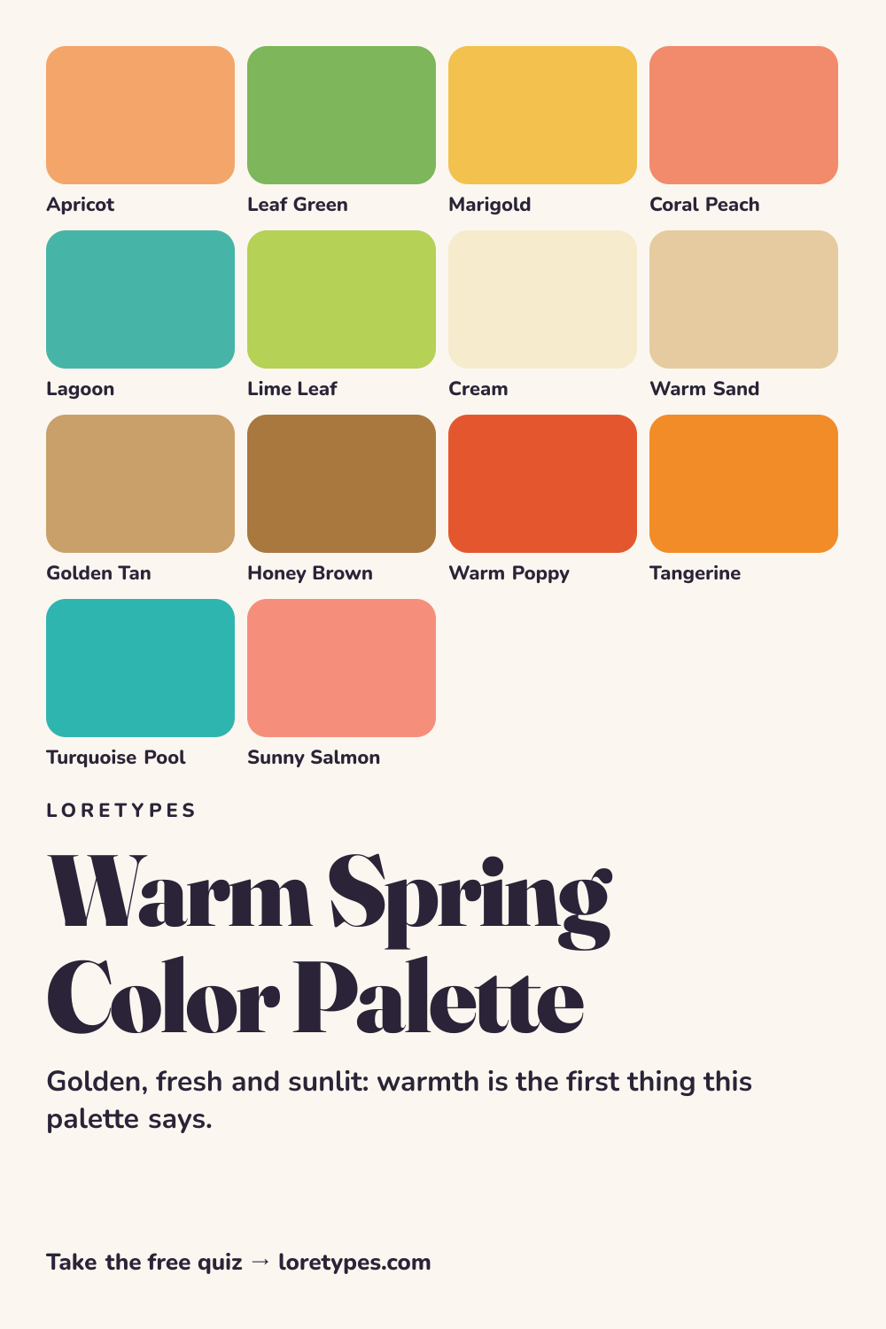
Best colors for Warm Spring
The strongest shades are the ones that look like ripe produce or midsummer grass: apricot, marigold, leaf green and coral peach. All of them contain visible yellow, which is the thread connecting the palette. Lagoon and lime leaf broaden the range into blue-green and spring green without losing the golden feel.
Choosing among them is mostly a question of volume. Marigold on a sweater is a bold choice; marigold on a mug or a notebook is a pleasant background note. Both are inside the palette.
Warm Spring neutrals
Neutrals are creamy and sandy rather than gray: cream, warm sand, golden tan and honey brown. They keep the palette feeling lit from within. Compare cream with a stark bleached white and you will see why cream tends to be the smoother partner for apricot and green.
For anything that needs to anchor an outfit, honey brown or golden tan replace black and charcoal. They have enough weight to ground the brighter colors without draining the warmth.
Warm Spring accent colors
Accent colors are the livelier ones: warm poppy, tangerine, turquoise pool and sunny salmon. Poppy and tangerine are the high-energy options, while turquoise pool provides a clean cool-leaning counterpoint that still reads as warm because of its green side.
A little goes a long way. A single poppy belt or turquoise cup next to cream and honey brown already counts as a complete palette moment.
Using Warm Spring colors day to day
Warm Spring colors do their best work in daylight, so they suit spring and summer wardrobes, picnic tables, garden spaces and anything seen outdoors. A cream shirt with golden tan chinos is a quiet start, and a coral peach or leaf green layer on top turns it into a full outfit. Because yellow is the thread through the palette, the pieces tend to mix easily.
Winter does not have to mean abandoning the palette. Honey brown coats, marigold scarves and cream knits keep the warmth indoors, and a turquoise pool accessory keeps a gray day from feeling flat. The practical rule is to put the lightest, warmest shades closest to the center of the arrangement and let the deeper ones sit lower.
Colors to use sparingly
The following families usually drag the sunny mood downward or turn it cold. Use them as occasional guests rather than regulars.
- Charcoal Black. Heavy, cool darkness flattens a palette built on golden light. Honey brown or dark olive-brown give weight with warmth.
- Icy Lavender. A pale violet with a cool tone has no yellow to bridge to the rest. Warm peach or soft aqua occupies the same lightness.
- Dusty Mauve. Grayed pink-purples feel subdued beside clear warm colors. Coral peach is a livelier substitute.
- Blue Gray. A cool, muted neutral looks sleepy against marigold. Warm sand or golden tan plays the same role.
Warm Spring color combinations
Here are four pairings to try, each described by color family so you can match them to what is in your closet or your shopping tab.
Wardrobe
A cream shirt with golden tan trousers and a coral peach cardigan is easy to wear and still looks sunlit. For a cooler variation, replace the cardigan with lagoon.
Accessories
Gold-toned jewelry, a honey brown leather bag and a marigold scarf make a focused set. A turquoise pool bracelet adds a small surprise.
Makeup colors
Peach blush, apricot or coral lip shades and warm brown eye colors fit the palette. Search by shade family and look for golden or peachy finishes.
Spaces and styling
Cream walls, a leaf green plant and a tangerine cushion produce a bright but gentle room. Natural wood in honey tones pulls it together.
Warm Spring vs Bright Spring and Warm Autumn
| Aspect | Warm Spring | Bright Spring | Warm Autumn |
|---|---|---|---|
| Warmth | Strongly warm; golden cast | Warm to neutral; slightly less golden | Warm and deep; spicy, earthy cast |
| Clarity | Clear and fresh | Very clear, almost vivid | Muted to moderate; toasted |
| Typical neutral | Cream, warm sand, golden tan | Warm white, light gray-taupe, clear navy | Camel, chestnut, olive-khaki |
| Signature accent | Warm poppy or tangerine | Hot coral or clear turquoise | Rust, mustard or burnt orange |
| Common mix-up | A red that is too blue-based looks cool | A yellow that is too gentle looks flat | A brown that is too deep dulls the sparkle |
Bright Spring is the sibling to check first. It shares the fresh clarity but pushes everything further, with more contrast and a slightly cooler, cleaner feel. If your favorite colors look electric rather than sunny, Bright Spring may be the closer palette.
Warm Autumn shares the warmth but deepens and tones it down. The question to ask is whether your warm colors look juicy and light or toasted and heavy. Juicy leans Warm Spring; toasted leans Autumn.
A small experiment with Warm Spring colors
Find something apricot or coral and something cream or sand. Set them next to each other on a window sill and note whether the pair feels bright and easy. Replace the cream with a stark white, then with a dull gray, and see which version you like best.
Next, add an accent. Try poppy against the pair, then turquoise pool. Keep a short list of the combinations that make you want to pick the objects up again; that list is the practical outcome of this exercise.
This site's quiz works from your palette preferences, not from a photo analysis. This quiz explores palette preferences. It does not measure your skin tone or physical features, and its result is a starting point for trying colors you enjoy.
Find my starting palette →Warm Spring color palette FAQ
What is the Warm Spring color palette?
It is a set of sunny, golden, fresh colors from the Spring family, including apricot, marigold, leaf green, coral peach and cream. The unifying feature is a visible yellow warmth with clear, lively saturation.
What are the best colors for Warm Spring?
Apricot, marigold, leaf green, coral peach and lagoon are the core choices. Cream, warm sand, golden tan and honey brown work as neutrals, and warm poppy or tangerine make good accents.
What colors does Warm Spring usually avoid?
Cool, heavy or grayed colors such as charcoal black, icy lavender, dusty mauve and blue-gray often feel out of tune with the sunny warmth. If you love one, try a warmer, lighter stand-in or keep it in a small detail.
How is Warm Spring different from Bright Spring?
Warm Spring emphasizes golden warmth with moderate contrast. Bright Spring emphasizes sharp clarity and higher contrast, with a slightly cooler, cleaner feel. Compare apricot with hot coral to see which one fits your pile.
Do I need a photo analysis to find Warm Spring?
No. The Loretypes quiz relies on your answers about warmth, depth, clarity and contrast preferences and does not analyze photos or physical features. Warm Spring may be offered as a starting palette to test with colors you already own.