Light Summer Color Palette
Pale, cool-leaning and powdery: a palette that feels like haze over water.
Light Summer is a palette of pale, cool-leaning colors with a soft, slightly hazy finish: powder blue, rose pink, lavender and a gentle sage. Among the twelve seasonal subtypes it sits at the light end of the depth scale, tilts toward the cool side of temperature, and is mildly muted rather than crisp. The result is a family of colors that blend into each other, with very little contrast between any two of them.
- Temperature: cool-leaning
- Depth: light
- Clarity: muted
- Contrast: low
It belongs to the Summer color season, one of three Summer subtypes in the twelve-season map used on this site.
Light Summer colors: 14 named shades
The fourteen shades below are named examples of that mood. Pale colors shift a lot between screens and daylight, so use the names as the main reference and the hex values as an approximation.
- Powder Blue
- Rose Pink
- Soft Lavender
- Pale Sage
- Dusty Periwinkle
- Orchid Mist
- Soft White
- Pearl Gray
- Cool Beige
- Smoke Blue
- Raspberry Milk
- Seafoam
- Lilac Plum
- Frosted Rose
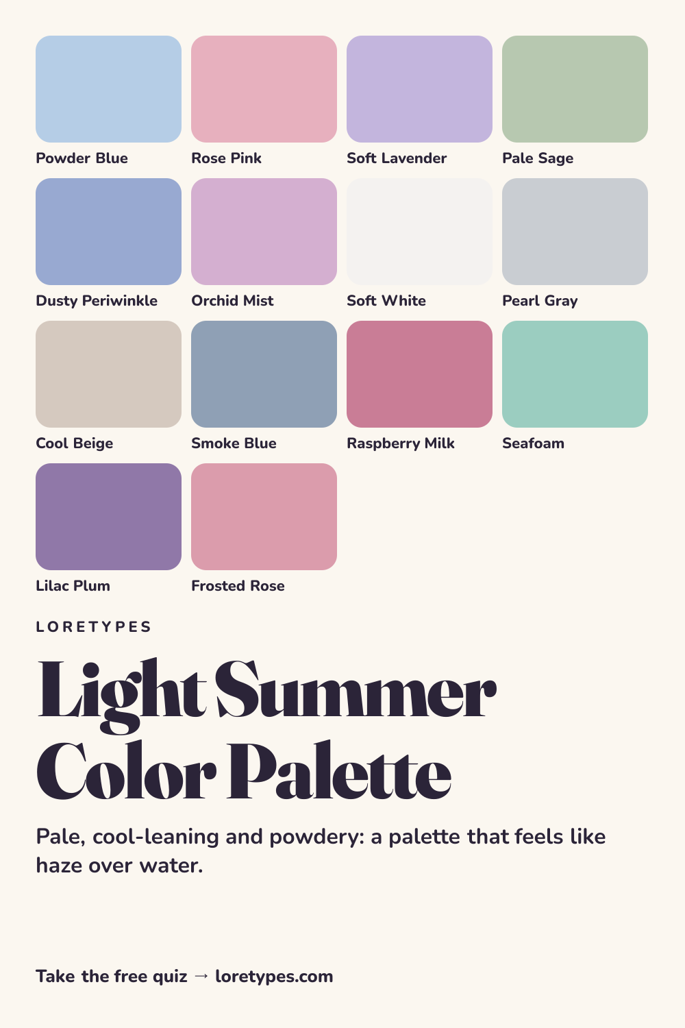
Best colors for Light Summer
The leading colors in this group are the ones that look like they have been rinsed in cool water: powder blue, rose pink, soft lavender and pale sage. They all carry a trace of gray or blue in the mix, which is what stops them from looking sugary.
Dusty periwinkle and orchid mist stretch the range a little. They bring in more color than a basic pale pastel but remain gentle, so they are good picks for a blouse, a knit or a bedroom wall when powder blue feels too plain.
A good sign that a shade belongs here is that you could imagine it described as "misty". Sharp, glossy or neon versions of the same hue tend to belong elsewhere.
Light Summer neutrals
Neutrals follow the same cool-and-soft rule. Soft white, pearl gray, cool beige and smoke blue provide base colors that never look heavy. Soft white replaces stark optic white, and pearl gray replaces black as the default for anything that needs to recede into the background.
Smoke blue is the deepest neutral in the set and plays the role that navy might play elsewhere. It is enough to anchor a coat or a bag, but it keeps the gentle atmosphere intact.
Light Summer accent colors
The accent group is made of mid-strength shades that stay cool: raspberry milk, seafoam, lilac plum and frosted rose. They are stronger than the base colors, but they never reach the intensity of a true red or a bright emerald.
Seafoam is a handy reminder that accents need not be pink or purple. It adds a refreshing note and pairs well with pearl gray and powder blue.
Using Light Summer colors day to day
Light Summer works well when an outfit is built in layers of similar lightness: a pearl gray trouser, a rose pink top, a soft lavender scarf. The pieces are not matched in color, yet they feel matched in mood, and that is the main trick of the palette. It is an especially easy fit for warm-weather clothing, lightweight knits and linen-style fabrics.
If a look feels flat, do not reach for something dark. Instead, step up one level in saturation with raspberry milk or lilac plum, and keep everything else pale. The change is subtle but it adds shape without breaking the haze. Keeping a few small swatches on your phone or in a notebook makes it easier to judge new items while shopping.
Colors to use sparingly
Strong, warm or very dark colors tend to overpower this palette. Each one below has a gentler stand-in that keeps the same idea.
- Jet Black. Black makes pale colors look washed out beside it. Smoke blue or pearl gray handles the same job without the harshness.
- Burnt Orange. A strong warm orange fights with cool pastels. Frosted rose gives some warmth in a quieter form.
- Mustard. Golden, medium-bright yellows can look harsh against lavender and powder blue. Pale sage is a calmer choice for a yellow-green idea.
- Hot Red. Saturated red creates sharp contrast. Raspberry milk offers a similar red-pink feel at a softer level.
Light Summer color combinations
Combinations here are all about gentle steps. Try the following, and adjust to the pieces you own.
Wardrobe
A soft white shirt, pearl gray trousers and a powder blue cardigan make a calm base. Replace the cardigan with rose pink for a slightly warmer version.
Accessories
Silver or white-gold-toned metal, a smoke blue bag and a lavender scarf finish an outfit without adding any hard edge.
Makeup colors
Look at rose, soft berry, mauve and pink-beige families in sheer or satin finishes. Color names with words like "dusty" or "soft" are a good filter, while strong orange or brown-red names are better left alone.
Home and desk
Powder blue walls, a cool beige sofa and a lilac throw make a quiet, light room. A seafoam plant pot is an easy small update.
Light Summer vs Light Spring and Soft Summer
| Aspect | Light Summer | Light Spring | Soft Summer |
|---|---|---|---|
| Lightness | Very light; airy | Very light and warmer | Medium; heavier and more blended |
| Temperature | Cool-leaning; rosy and blue | Warm-leaning; peachy and golden | Cool-leaning with a gray cast |
| Clarity | Softly muted | Clear and fresh | Strongly muted |
| Typical neutral | Soft white, pearl gray, cool beige | Ivory, light camel, warm dove | Charcoal-gray, stone, mushroom |
| Common mix-up | A pink that turns coral loses the coolness | A mint that turns blue feels too icy | A lavender that turns bright feels too clean |
The nearest relative is Soft Summer. Both palettes are cool-leaning and quiet, but Light Summer is airier and Soft Summer is deeper and grayer. If your favorite shades look like the pale, watercolor version of dusty rose and gray-green, Light Summer is closer.
Light Spring is the other neighbor, sharing the pale quality but changing the temperature. A quick check is to place a peach item and a rose item next to a favorite pale top. Whichever one blends more easily tells you which direction to explore.
A small experiment with Light Summer colors
Pick a pale blue item and a pale pink item and set them next to each other in morning light. Notice whether they feel like part of the same soft family. Then add something crisp white or bright red, and check what happens to the mood.
Repeat with a lavender object and a gray one. Keep a short list of the pairings you liked at first glance and the ones you liked after a day. Those lists will tell you more than any category name.
This site's quiz works from your palette preferences, not from a photo analysis. This quiz explores palette preferences. It does not measure your skin tone or physical features, and its result is a starting point for trying colors you enjoy.
Find my starting palette →Light Summer color palette FAQ
What is the Light Summer color palette?
It is a set of pale, cool-leaning, softly muted colors from the Summer family, including powder blue, rose pink, soft lavender and pale sage. The colors are close in lightness, so combinations tend to look smooth and low in contrast.
What are the best colors for Light Summer?
Powder blue, rose pink, soft lavender, pale sage, dusty periwinkle and orchid mist are the main colors. Soft white, pearl gray, cool beige and smoke blue serve as neutrals, with raspberry milk, seafoam and lilac plum as accents.
What colors should Light Summer avoid?
Heavy or intense colors, such as jet black, burnt orange, mustard and hot red, tend to overpower the soft balance. They are not off limits; use small amounts, or pick a gentler relative like smoke blue, frosted rose or pale sage.
What is the difference between Light Summer and Soft Summer?
Both are cool-leaning and quiet. Light Summer is paler and airier, with powder blue and rose, while Soft Summer is deeper and grayer, with dusty rose, slate and gray-green. If you want the lighter, more watercolor-like version, choose Light Summer.
Can a quiz tell me I am Light Summer?
The Loretypes quiz can suggest Light Summer when your answers favor pale, cool-leaning, low-contrast combinations. It reads palette preferences only, never photos or physical traits, so the result is an idea to test against clothes you already own.
More color season palettes
- Summer color season
- Soft Autumn color palette
- Soft Summer color palette
- Warm Spring color palette
- Bright Spring color palette
- Deep Winter color palette
- Deep Autumn color palette
- Light Spring color palette
- Cool Summer color palette
- Warm Autumn color palette
- Cool Winter color palette
- Bright Winter color palette
- 16 seasonal color analysis