Deep Autumn Color Palette
Rich, warm-leaning and grounded: dark earth tones with a metallic glow.
Deep Autumn is the darkest, most grounded palette in the Autumn family. In the 12-season map it leans warm, sits at the deep end of lightness and falls on the muted-to-moderate side of clarity, so the colors look rich and earthy rather than glossy. Contrast is medium-high, produced by dark anchors set against creamy light shades. Espresso, forest green and mahogany are the typical foundations, with copper as the signature metallic glow.
- Temperature: warm-leaning
- Depth: deep
- Clarity: muted
- Contrast: medium-high
It belongs to the Autumn color season, one of three Autumn subtypes in the twelve-season map used on this site.
Deep Autumn colors: 14 named shades
The fourteen swatches below are named examples. Deep shades are tricky on a screen, so judge them against real fabric or paint in daylight whenever possible.
- Espresso
- Forest Green
- Deep Teal
- Mahogany
- Dark Olive
- Bordeaux
- Warm Charcoal
- Deep Taupe
- Antique Ivory
- Bronze Khaki
- Copper
- Pumpkin Spice
- Antique Gold
- Pomegranate
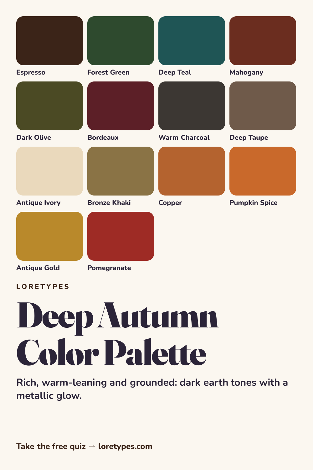
Best colors for Deep Autumn
The central colors are the ones you would find in a forest in late autumn or a leather-bound library: espresso, forest green, mahogany, dark olive and bordeaux. They are deep without being cold, and each has a hint of brown or red underneath, which is what ties them to the warm side of the map.
Deep teal is the cooler exception. It gives the palette a blue-green option that is still dark and earthy, useful for a sweater or a notebook when a wardrobe of browns begins to look monotone.
Deep Autumn neutrals
Neutrals follow the earth theme: warm charcoal, deep taupe, bronze khaki and antique ivory. Warm charcoal replaces black; antique ivory replaces white. The result is a set of base colors that look rich instead of stark.
An all-neutral outfit in this palette, such as deep taupe trousers with an antique ivory knit and a warm charcoal coat, is already complete and rarely looks flat because every piece has depth.
Deep Autumn accent colors
Accent colors glow rather than shout: copper, pumpkin spice, antique gold and pomegranate. They read like metal, spice and fruit, and they are most effective in small touches such as a belt buckle, a scarf, or a set of ceramic mugs.
Copper is the most distinctive of the group. Placed next to forest green or espresso, it produces the signature Deep Autumn effect of warmth against shadow.
Using Deep Autumn colors day to day
Deep Autumn colors are comfortable in textured materials such as wool, suede, linen and brushed cotton, where depth looks natural rather than flat. A mahogany sweater, dark olive trousers and a deep taupe coat combine into a rich cold-weather set, and in summer the same shades can be lightened with antique ivory and bronze khaki while staying inside the palette.
A good way to extend the palette is through metals and wood. Copper, brass and walnut work like extra colors, so a copper watch, a leather belt in cognac and a bordeaux notebook can finish an outfit or a desk. When you are unsure about a new shade, ask whether it would look natural in an old library or a late-autumn forest; if it would, it likely belongs.
Colors to use sparingly
These shades usually look too pale, too cold or too neon for a palette built on depth and earth. Substitutes are suggested rather than strict rules.
- Baby Pink. A pale, cool pastel has no weight. A warm rose or soft brick offers some of the same softness.
- Icy Blue. A frosty tone feels disconnected from earthy darks. Deep teal brings in blue with the right depth.
- Neon Green. Electric brightness breaks the muted, rich mood. Forest green or dark olive keeps the hue.
- Silver Gray. A cool, light neutral fights with warm browns. Antique ivory or bronze khaki fits better.
Deep Autumn color combinations
The palette responds well to layering and texture. These four groupings are written as ideas to adapt.
Wardrobe
An espresso jacket over an antique ivory top with bronze khaki trousers is a dependable base. A mahogany scarf adds a warm focal point without adding a new silhouette.
Accessories
Brass, copper or antique-gold metals, a cognac leather bag and a forest green wallet fit right in. For variety, add a pomegranate accent on a cuff or a hat.
Makeup colors
Look for brick, terracotta-brown, bronze and deep warm berry categories with a matte or satin finish. Describe them by color family when searching.
Rooms and decor
Dark olive walls, a bordeaux rug and copper lamps make a cozy, high-contrast room. Antique ivory curtains lighten the effect.
Deep Autumn vs Warm Autumn and Deep Winter
| Aspect | Deep Autumn | Warm Autumn | Deep Winter |
|---|---|---|---|
| Depth | Deep | Medium-deep | Deep |
| Warmth | Warm-leaning; brown and red cast | Strongly warm; golden and spicy | Slightly cool; blue-black cast |
| Typical neutral | Espresso, deep taupe, antique ivory | Camel, chestnut, olive-khaki | Black ink, charcoal, snow |
| Signature accent | Copper or pomegranate | Turmeric or rust | True red or emerald |
| Common mix-up | A brown that is too light loses the depth | A rust that is too bright looks orange | A white that is too stark clashes with warm darks |
Warm Autumn is the sibling to check first. It shares the warmth and the earthiness but is lighter and spicier, with turmeric and rust rather than espresso and bordeaux. If your favorite darks are the heaviest in your pile, Deep Autumn is likely closer.
Deep Winter is the cross-season neighbor. It has the same depth but a cooler lean and sharper contrast. A navy that looks nearly black and a plum that looks blue-violet suggest the Winter side.
A small experiment with Deep Autumn colors
Put an espresso or forest green item next to an antique ivory one, then next to stark white. The first pairing should feel warm and settled. If the second one feels harsh, you are probably responding to the warm depth of this palette.
Add a copper or pumpkin accent to the winning pair and notice how it changes the mood. Make a short list of the combinations you would repeat, and revisit it in different light and on a different day.
This site's quiz works from your palette preferences, not from a photo analysis. This quiz explores palette preferences. It does not measure your skin tone or physical features, and its result is a starting point for trying colors you enjoy.
Find my starting palette →Deep Autumn color palette FAQ
What is the Deep Autumn color palette?
It is a set of rich, warm-leaning dark colors from the Autumn family, including espresso, forest green, mahogany, bordeaux and dark olive, with copper and antique gold as metallic accents. The colors are deep and earthy rather than bright.
What are the best colors for Deep Autumn?
Espresso, forest green, deep teal, mahogany, dark olive and bordeaux are the core. Warm charcoal, deep taupe, antique ivory and bronze khaki are the neutrals, while copper, pumpkin spice, antique gold and pomegranate make good accents.
What colors does Deep Autumn avoid?
Pale cool pastels, neon shades and silver-gray neutrals tend to feel disconnected from the earthy darks. If you like them, try a warmer or deeper equivalent, such as warm rose, forest green or antique ivory.
How is Deep Autumn different from Deep Winter?
Both rely on dark, rich colors. Deep Autumn leans warm, with espresso, forest and copper, while Deep Winter leans cool, with midnight navy, plum and icy lights. Check whether your darkest favorite looks brown-black or blue-black.
Does the quiz use my photo to suggest Deep Autumn?
No. The Loretypes quiz is based on palette preferences for warmth, depth, clarity and contrast, and does not use photos or physical features. A Deep Autumn result is a starting point to test with colors you already own.