Cool Winter Color Palette
Icy, blue-based and crisp: clear cool colors with a sharp edge.
Cool Winter is a palette of icy, blue-based colors that are clear and crisp rather than dusty: cobalt, cool berry, steel gray, emerald and a blue-leaning red. Compared with the rest of the twelve-season map it has the coldest temperature of the Winter family, a medium-deep lightness, high clarity and fairly strong contrast. The distinguishing feature is that every color has a clean blue note, so the palette looks cold and bright at once, like a frozen lake under a clear sky.
- Temperature: clearly cool
- Depth: medium-deep
- Clarity: clear
- Contrast: medium-high
It belongs to the Winter color season, one of three Winter subtypes in the twelve-season map used on this site.
Cool Winter colors: 14 named shades
Below are fourteen named shades that illustrate the palette. Screens render saturated cool colors reasonably well, but fabric still looks different in daylight, so compare names and hex values with real items.
- Cobalt
- Cool Berry
- Emerald
- Royal Plum
- Icy Violet
- Blue Red
- Steel Gray
- Pure White
- Navy
- Silver
- Hot Magenta
- Icy Aqua
- Lemon Ice
- Teal Blue
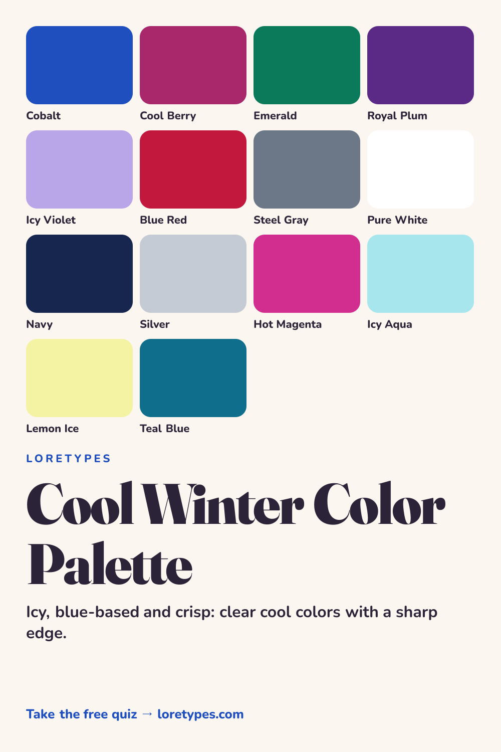
Best colors for Cool Winter
Cobalt, cool berry, emerald and royal plum are the strong core. All four are saturated and all four lean toward blue, which is why they feel crisp together. Cobalt is the reference point: if a color looks like it could sit beside cobalt without competing, it likely belongs.
Icy violet and blue red round out the range. The violet is the lightest of the main colors and provides a clear, airy note, while the blue red supplies the sort of warmth that does not drift toward orange. A blue red scarf over a cobalt coat is a typical idea.
Because this palette favors clarity, avoid anything that looks smoky or dusty. A color that needs the word "muted" to describe it is probably a better fit for the Summer family.
Cool Winter neutrals
Neutrals can be stark. Pure white, navy, steel gray and silver all work, and pure white is entirely welcome here, unlike in the gentler palettes. A navy and white pairing is a natural default, and steel gray is the middle step when you want less drama.
Black is also usable, particularly in formal clothing. Used with white or an icy accent it produces the sort of sharp contrast that suits the palette.
Cool Winter accent colors
Accents come in two moods: electric and icy. Hot magenta and teal blue are electric. Icy aqua and lemon ice are frosty, with a pale, sorbet-like brightness. Both kinds work as small spots against navy and steel gray.
Lemon ice is the unexpected one. A very pale, cool-leaning yellow can lift a dark outfit in a way that a golden yellow cannot, but it needs to stay icy, not buttery.
Using Cool Winter colors day to day
Cool Winter clothes look best when they have clean lines and good definition. A navy blazer over a white shirt with steel gray trousers is a solid weekday base, and a cobalt or cool berry piece makes it feel particular to the palette. In casual situations, a royal plum sweater and silver-gray jeans are a straightforward choice.
The usual risk is mixing in warm tones by accident. Camel, olive and cream can sneak into a wardrobe, and they tend to blur the crispness. Keep a rule of thumb: if the metal in your accessories is silver, your colors probably need to be cool as well. When in doubt, compare any new item with a cobalt piece and decide whether they look like relatives.
Colors to use sparingly
Warm, earthy and heavily muted colors weaken the crisp character of this palette. Here are the main culprits and cooler replacements.
- Camel. A golden brown feels warm and soft next to cobalt. Steel gray or navy offers a more suitable neutral.
- Orange. Orange has no blue in it and pulls attention away from the palette. Blue red or cool berry gives the same punch in a cooler form.
- Olive. Yellow-green earth tones turn muddy against icy colors. Emerald is a cleaner green choice.
- Dusty Rose. A gray-pink looks faded beside saturated cool shades. Cool berry or hot magenta keeps the pink family clear.
Cool Winter color combinations
Strong combinations start with a high-contrast pair and then add one clear color. A few possibilities follow.
Wardrobe
A navy coat, a pure white shirt and steel gray trousers are the classic frame. Put a cobalt scarf or a cool berry knit on top for a distinctive focal point.
Accessories
Silver, platinum or white-gold-toned metal, a navy leather bag and an icy violet scarf work together. For evening, a small emerald detail is enough.
Makeup colors
Look at blue-red, cool pink, berry and plum families in clean, true-to-color finishes. Orange-leaning corals and brown-based nudes belong to a different mood.
Home and desk
White walls, a navy sofa and a cool berry cushion make a crisp room. Silver frames and an emerald plant pot add polish.
Cool Winter vs Deep Winter and Cool Summer
| Aspect | Cool Winter | Deep Winter | Cool Summer |
|---|---|---|---|
| Temperature | Clearly cool; icy, blue-based | Slightly cool; softer and inkier | Clearly cool but softened |
| Depth | Medium-deep | Deep | Medium-light |
| Clarity | Clear and crisp | Clear with dark anchors | Gently muted |
| Typical neutral | Navy, steel gray, pure white | Black ink, charcoal, snow | Silver gray, cool taupe, blue charcoal |
| Common mix-up | A red that turns orange loses the chill | A plum that turns brown loses richness | A rose that turns peach feels warm |
Deep Winter is the darker neighbor. It uses the same crisp feeling but gets there through black ink, midnight navy and pine green. If your favorite shades are the really dark ones, with pale icy lights beside them, Deep Winter is closer. If your favorites are bright cool mid-tones like cobalt and magenta, Cool Winter fits better.
Cool Summer shares the blue base but softens everything. Cobalt becomes slate blue, and cool berry becomes raspberry rose. A quick test is to hold a crisp cobalt item and a softer slate item against your favorite clothes and notice which feels easier to wear.
A small experiment with Cool Winter colors
Place a navy item and a pure white item side by side, then add a cool berry or cobalt item. Look at how the three interact in daylight. Next, swap the white for cream and notice whether the group loses its sharpness.
Test two metals as well: a silver ring or watch and a gold one beside the same group. Record which pairing you reach for again over the following week. Those repeated choices tell you more than a label would.
This site's quiz works from your palette preferences, not from a photo analysis. This quiz explores palette preferences. It does not measure your skin tone or physical features, and its result is a starting point for trying colors you enjoy.
Find my starting palette →Cool Winter color palette FAQ
What is the Cool Winter color palette?
It is a set of icy, blue-based, clear colors from the Winter family, such as cobalt, cool berry, emerald, royal plum and steel gray. It has strong cool character, high clarity and fairly strong contrast.
What are the best colors for Cool Winter?
Cobalt, cool berry, emerald, royal plum, icy violet and blue red make up the core. Navy, steel gray, silver and pure white are neutrals, while hot magenta, icy aqua, lemon ice and teal blue are suitable accents.
What colors should Cool Winter avoid?
Warm and dusty colors, including camel, orange, olive and dusty rose, tend to blur the crispness. They are not off limits; use them in tiny amounts or switch to a cooler relative like navy, blue red, emerald or cool berry.
What is the difference between Cool Winter and Deep Winter?
Both are Winter palettes with clear colors. Cool Winter is about cold, blue-based mid-tones like cobalt and magenta, while Deep Winter is about darkness, with midnight navy, plum and pine. Consider whether your favorites feel icy or inky.
Can the Loretypes quiz suggest Cool Winter?
It can suggest Cool Winter if your answers favor cool, clear, high-contrast combinations. The quiz works from palette preferences only, never photos or physical features, so the result is a set of colors to try rather than a fixed identity.
More color season palettes
- Winter color season
- Soft Autumn color palette
- Soft Summer color palette
- Warm Spring color palette
- Bright Spring color palette
- Deep Winter color palette
- Deep Autumn color palette
- Light Spring color palette
- Light Summer color palette
- Cool Summer color palette
- Warm Autumn color palette
- Bright Winter color palette
- 16 seasonal color analysis