Deep Winter Color Palette
Dark, cool-leaning and dramatic: deep anchors with a few icy lights.
Deep Winter is the dark, dramatic end of the Winter family. On the three main dimensions it leans slightly cool, goes to the deep end of the lightness scale and sits on the clear rather than muted side, so the colors look rich and saturated instead of dusty. Contrast is the highest of any subtype, because a few icy pale shades are placed against inky anchors. Midnight navy, plum and pine are the typical foundations.
- Temperature: cool-leaning
- Depth: deep
- Clarity: clear
- Contrast: high
It belongs to the Winter color season, one of three Winter subtypes in the twelve-season map used on this site.
Deep Winter colors: 14 named shades
These fourteen named swatches illustrate the palette. Dark colors are the hardest to judge on a screen, so compare names and hex codes with fabrics in daylight if you can.
- Midnight Navy
- Deep Plum
- Pine Green
- Burgundy
- Ink Teal
- Royal Purple
- Black Ink
- Charcoal
- Icy Gray
- Snow
- True Red
- Icy Pink
- Emerald
- Frost Blue
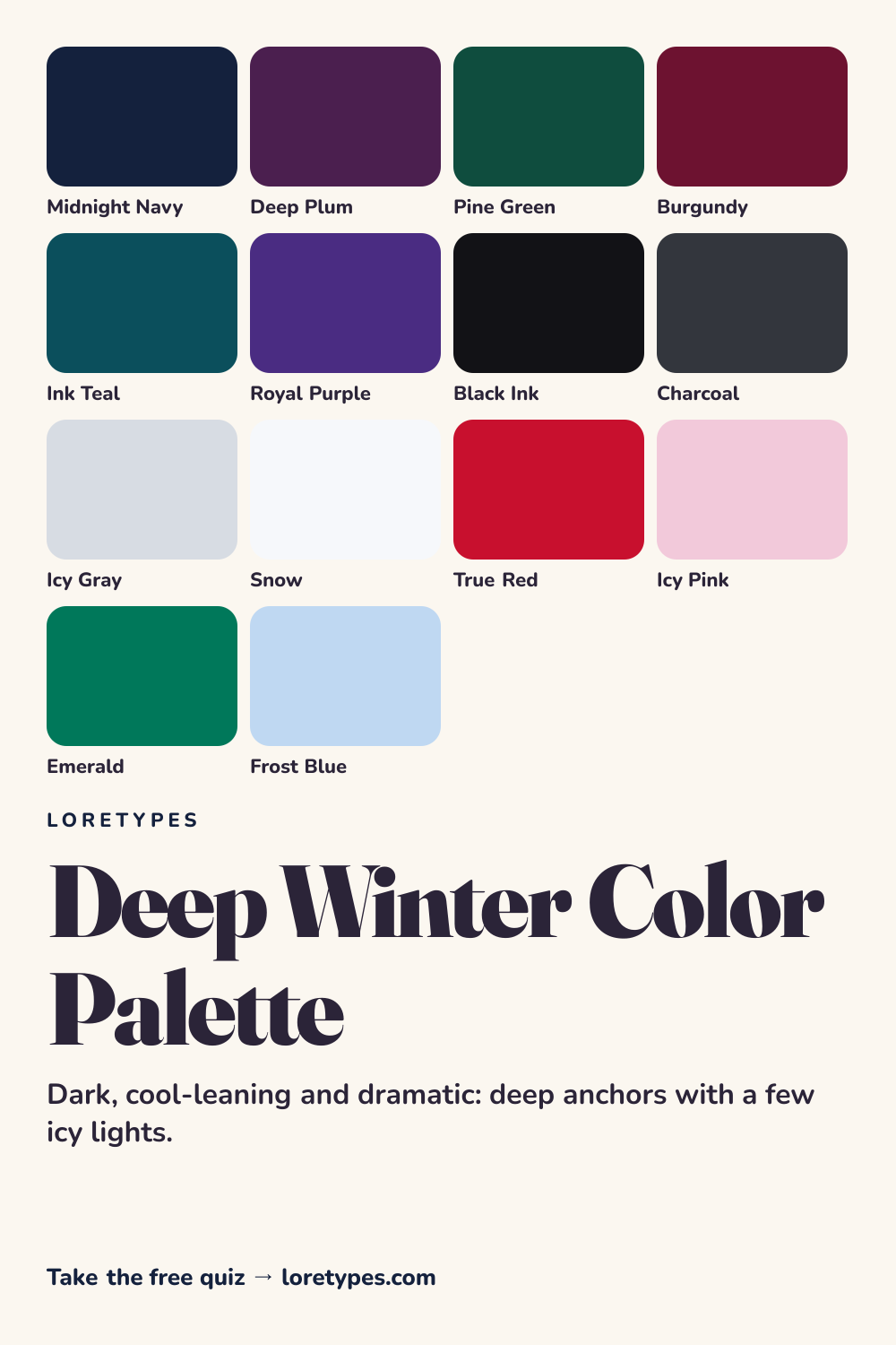
Best colors for Deep Winter
The base shades are jewel-toned and dark: midnight navy, deep plum, pine green, burgundy, ink teal and royal purple. Each reads as a rich, saturated color even in low light, and each has a slight cool lean rather than a rusty one. They are the colors you want to have the most volume of.
Because the palette runs dark, it does well in structured or tailored pieces, where a deep color can hold its shape. A burgundy coat or a plum dress carries the whole idea without needing help.
Deep Winter neutrals
Neutrals come in two extremes. Black ink and charcoal supply depth, while icy gray and snow supply light. Unlike the soft palettes, there is no comfortable middle: Deep Winter works best when the neutrals are either very dark or very pale.
Using black and white together is therefore natural here, not harsh. A charcoal suit with a snow shirt is a typical Deep Winter move, and a pop of true red completes it.
Deep Winter accent colors
Accents are either vivid or frosted: true red, emerald, icy pink and frost blue. The vivid ones add temperature and punch. The frosted ones act as light spots in an otherwise dark arrangement, and they are what stop the palette from looking heavy.
Try one icy accent per outfit near the neckline or the hands, where the pale tone has the most room to be seen against the deep surroundings.
Using Deep Winter colors day to day
Deep Winter colors feel at home in structured clothing and bold interiors, where a dark shade can fill a large area without losing definition. A navy coat over a charcoal sweater is the baseline for cold months, and a burgundy or emerald piece adds the richness that separates the palette from plain black and gray. Evening wear in plum or pine feels especially natural.
Because contrast is the point, avoid middle-of-the-road tones that sit halfway between the dark and light ends. If a color looks neither deep nor pale, try pushing it one way or the other. A snow-white shirt under a midnight blazer, or a frost blue scarf against a pine coat, shows the logic: strong anchors, clean lights, and a small flash of red or emerald where you want the eye to land.
Colors to use sparingly
These colors lack either the depth or the cool clarity of the palette. Reach for a deeper or cleaner substitute where possible.
- Beige. A soft mid-tone neutral has no contrast. Snow or icy gray offers a clearer light partner for dark colors.
- Peach. A warm pale shade lacks the cool edge. Icy pink gives a similar softness with the right temperature.
- Mustard. Golden, medium-toned colors turn muddy beside navy and plum. Emerald or true red are the better pops.
- Dusty Sage. Grayed green mutes the richness. Pine green or emerald delivers the same hue at full depth.
Deep Winter color combinations
The palette thrives on strong, clean combinations. Here are four to try, using only color families you can look up easily.
Wardrobe
A midnight navy blazer, a snow shirt and charcoal trousers are the baseline. A burgundy scarf or tie turns it into a Deep Winter outfit with a clear focal point.
Accessories
Silver-toned or cool-gold metals, a black leather bag and a true red wallet work well. For evening, add a small frost blue or icy pink detail.
Makeup colors
Look for deep berry, wine, true red and cool plum categories, with a clean finish. The goal is saturation and a little depth, not a washed-out pastel.
Interiors
Pine green walls, a plum throw and a snow-white trim create a rich, dramatic room. A single frost blue vase supplies the cool light.
Deep Winter vs Deep Autumn and Cool Winter
| Aspect | Deep Winter | Deep Autumn | Cool Winter |
|---|---|---|---|
| Warmth | Slightly cool; blue-black cast | Slightly warm; brown-black cast | Clearly cool; icy, blue-based cast |
| Depth | Deep | Deep | Medium-deep |
| Typical neutral | Black ink, charcoal, snow | Espresso, warm charcoal, antique ivory | Steel gray, navy, pure white |
| Signature accent | True red or emerald | Copper or pomegranate | Cobalt or cool magenta |
| Common mix-up | A burgundy that is too brown loses the cool edge | A green that is too blue looks wintry | A navy that is too light loses the dramatic depth |
Deep Autumn is the closest neighbor because both palettes rely on dark, rich anchors. The difference is warmth: if the deepest colors you love are espresso and forest, the Autumn side is closer, whereas midnight navy and plum lean to Winter.
Cool Winter shares the cool tone but is a little lighter and more blue-focused. When your favorite dark shades feel rich rather than icy, Deep Winter fits better; when they feel crisp, cobalt-leaning and cold, Cool Winter might.
A small experiment with Deep Winter colors
Take a dark navy or plum item and set it against snow white, then against beige. Which version has more presence? A strong preference for the first usually indicates the high-contrast side of the palette.
Next, add a deep accent such as burgundy, then an icy one such as frost blue. Observe which makes the pair feel more finished and keep the notes. The combinations you reach for again are the real result.
This site's quiz works from your palette preferences, not from a photo analysis. This quiz explores palette preferences. It does not measure your skin tone or physical features, and its result is a starting point for trying colors you enjoy.
Find my starting palette →Deep Winter color palette FAQ
What is the Deep Winter color palette?
It is a collection of dark, saturated, slightly cool colors from the Winter family, including midnight navy, deep plum, pine green and burgundy. Pale icy shades are added as light points, which creates the high contrast that characterizes the palette.
What are the best colors for Deep Winter?
Midnight navy, deep plum, pine green, burgundy, ink teal and royal purple are the core shades. Black ink, charcoal, icy gray and snow are the main neutrals, and true red, emerald, icy pink and frost blue are good accents.
Which colors does Deep Winter avoid?
Soft or medium-toned shades such as beige, peach, mustard and dusty sage usually look flat beside the deep, high-contrast colors. If you want those hues, move to a deeper or icier relative, such as pine green or icy pink.
What is the difference between Deep Winter and Deep Autumn?
Both are dark and rich. Deep Winter leans cool, with navy, plum and icy lights, while Deep Autumn leans warm, with espresso, forest and copper. Check whether your favorite darkest shade looks blue-black or brown-black.
Can a quiz tell me I am Deep Winter?
The Loretypes quiz can suggest Deep Winter if your answers favor deep, cool-leaning, high-contrast combinations. It uses stated preferences only, with no photos or physical measurements, so the result is a palette to try rather than a fixed identity.