Bright Spring Color Palette
Clear, vivid and lively: saturated color set against clean light neutrals.
Bright Spring is the high-clarity palette of the Spring family. On the three main dimensions it leans mildly warm, sits near the middle in depth and takes the top spot for clarity: every shade looks clean, saturated and freshly dyed. Because the light and dark ends of the palette are far apart, contrast runs medium-high. Think coral against cream, turquoise against clear navy, sunshine yellow against crisp white.
- Temperature: warm-leaning
- Depth: medium
- Clarity: very clear
- Contrast: medium-high
It belongs to the Spring color season, one of three Spring subtypes in the twelve-season map used on this site.
Bright Spring colors: 14 named shades
Below are fourteen named colors to test. Vivid shades are especially sensitive to screens and printing, so compare the names with real objects when you can.
- Clear Coral
- Turquoise
- Fresh Green
- Sunshine Yellow
- Clear Azure
- Peony Pink
- Cream White
- Soft Gray Taupe
- Clear Navy
- Cocoa
- Tomato Red
- Lime Pop
- Orchid Pop
- Mango Orange
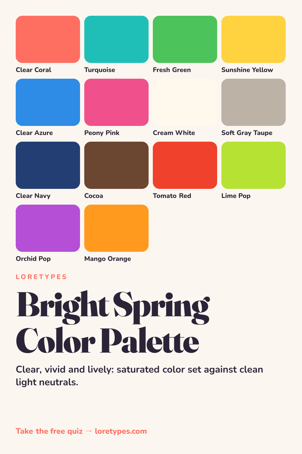
Best colors for Bright Spring
What defines the core group is intensity. Clear coral, turquoise, fresh green, sunshine yellow, azure and peony pink are all fully saturated, with no gray dulling them. They look right when they are the cleanest version of their hue, the way a highlighter or a ripe pepper is.
You can combine two or three of them in the same outfit more freely than in a muted palette, as long as there is a light or dark neutral in between to give each color room to breathe.
Bright Spring neutrals
Neutrals in this palette are either crisp or deep: cream white, soft gray taupe, clear navy and cocoa. The two darker ones give the vivid colors something to stand against, while cream white and the light taupe keep large areas from becoming overwhelming.
Clear navy is the typical stand-in for black. It supplies the same depth with a cleaner, more colorful feel, which is why it appears so often in Bright Spring combinations.
Bright Spring accent colors
Accents here are the strongest colors in the set: tomato red, lime pop, orchid pop and mango orange. They are what you pull out for a single dramatic detail, such as a belt, a bag or a pair of sneakers.
Because the base palette is already vivid, an accent works best when it is placed on a neutral, not on another bright color. Tomato red on cream white lands as intended; tomato red on peony pink is a different, louder idea.
Using Bright Spring colors day to day
Bright Spring colors suit a visible, confident look, and they reward simple shapes. A clean white shirt, navy trousers and a coral bag read as a complete idea, while a fresh green top with cocoa trousers feels just as deliberate. The trick is to let one vivid color lead and let the others play support.
On a practical level, check each new purchase for clarity. Hold it beside a similar item that is a touch duller and see which one makes the other look tired. If the clearer one wins and you still like it, it is probably in the palette. Rooms, packaging and slides follow the same rule: one saturated lead, clean neutrals, and nothing murky in between.
Colors to use sparingly
Some colors take the clarity out of the picture or add a heaviness the palette does not need. These are the ones most often worth swapping.
- Dusty Sage. A grayed green looks flat beside fresh green and turquoise. Fresh green does the same job at full strength.
- Taupe Brown. A heavy, dull brown softens contrasts that this palette depends on. Cocoa or clear navy is cleaner.
- Antique Rose. A faded pink loses against peony pink and coral. Aim for the clear version of the same hue.
- Muddy Olive. Dark murky green lowers the clarity of any partner. Lime pop or fresh green keeps the energy up.
Bright Spring color combinations
These groupings show how to build with vivid shades without everything fighting for attention.
Wardrobe
A clear navy blazer, a cream white tee and coral trousers is a high-contrast set that still looks balanced. Add turquoise as a bag or shoe for a second pop.
Accessories
A mango orange scarf, a cocoa leather strap and a lime pop phone case turn a neutral outfit into a lively one. Keep the metal bright and polished rather than antique.
Makeup colors
Look for clear coral, peony pink and bright berry-pink categories in satin or glossy finishes. The family goal is color that looks fresh instead of faded.
Graphics and slides
A cream white background with clear navy text and one azure or coral highlight is easy to read and clearly belongs to this palette.
Bright Spring vs Warm Spring and Bright Winter
| Aspect | Bright Spring | Warm Spring | Bright Winter |
|---|---|---|---|
| Clarity | Very clear; saturated and clean | Clear but golden and softer | Very clear, with a cooler, sharper edge |
| Contrast | Medium-high | Moderate | High |
| Typical neutral | Cream white, clear navy, cocoa | Cream, warm sand, honey brown | Pure white, black, charcoal |
| Signature accent | Tomato red or lime pop | Warm poppy or tangerine | Fuchsia or emerald |
| Common mix-up | A coral that is too muted loses its pop | A yellow that is too neon looks sharp | A pink that is too blue looks icy |
Warm Spring is the closest relative inside the family. The shared quality is the fresh, sunny mood; the difference is intensity. If your preferred colors feel golden and relaxed, Warm Spring is likely closer; if they feel electric and high-contrast, Bright Spring is.
Bright Winter is the cross-season neighbor. It has the same clarity but a cooler, more dramatic tone and sharper contrast. A coral that tilts pink and a navy that tilts black point in that direction.
A small experiment with Bright Spring colors
Pick a coral or turquoise item and put it on a cream white background, then on a dull beige one. Which version looks more alive? That reaction is the clarity axis in action.
Now add a neutral from each end: clear navy and cream white. See which one makes your vivid color feel more at home. Write down the combination you would actually use, and repeat in another light on a different day.
This site's quiz works from your palette preferences, not from a photo analysis. This quiz explores palette preferences. It does not measure your skin tone or physical features, and its result is a starting point for trying colors you enjoy.
Find my starting palette →Bright Spring color palette FAQ
What is the Bright Spring color palette?
It is a group of clear, saturated and lively colors from the Spring family, such as coral, turquoise, fresh green, sunshine yellow and peony pink. The distinguishing feature is clarity: nothing looks dusty, and contrast between light and dark tends to be strong.
What are the best colors for Bright Spring?
Clear coral, turquoise, fresh green, sunshine yellow, azure and peony pink are the core group. Cream white, clear navy, soft gray taupe and cocoa are the main neutrals, and tomato red, lime pop, orchid pop and mango orange are lively accents.
What should Bright Spring avoid?
Grayed or dusty shades such as dusty sage, antique rose, taupe brown and muddy olive tend to flatten the palette. You can wear them occasionally, but a clear version of the same hue usually works better.
How do I tell Bright Spring from Warm Spring?
Warm Spring is golden and moderately contrasted, with peach and apricot at the center. Bright Spring is cleaner and sharper, with higher contrast and vivid colors such as coral and turquoise. Hold apricot and hot coral side by side to see which one feels more like you.
Is Bright Spring the same as Bright Winter?
No, although both are high in clarity. Bright Spring leans warm and fresh, with cream and navy as neutrals. Bright Winter leans cool and dramatic, with white and black as neutrals. The temperature of your favorite pinks and blues usually separates them.