Soft Autumn Color Palette
Warm, muted and low in contrast: colors that sit close together and never shout.
Soft Autumn is the muted, gently warm corner of the 12-season map. On the three main dimensions it leans warm but not hot, sits in the middle on depth, and is clearly low on clarity, which means every color looks slightly grayed or dusted rather than freshly saturated. Because the shades are close in lightness, a Soft Autumn palette reads as one calm family: sage next to camel next to terracotta, with no sharp jumps between them.
- Temperature: warm-leaning
- Depth: medium
- Clarity: very muted
- Contrast: very low
It belongs to the Autumn color season, one of three Autumn subtypes in the twelve-season map used on this site.
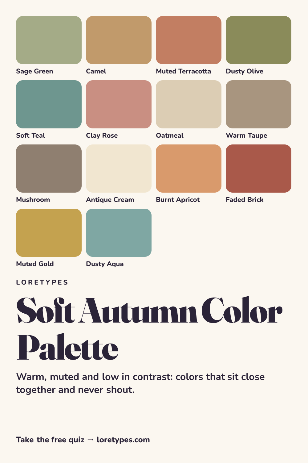
Soft Autumn colors: 14 named shades
These fourteen named colors are examples to hold against things you already own. Screens shift every shade a little, so treat the hex values as a guide and the names as the idea.
- Sage Green
- Camel
- Muted Terracotta
- Dusty Olive
- Soft Teal
- Clay Rose
- Oatmeal
- Warm Taupe
- Mushroom
- Antique Cream
- Burnt Apricot
- Faded Brick
- Muted Gold
- Dusty Aqua
Best colors for Soft Autumn
The core of the palette is a group of earthy, softened mid-tones: sage green, dusty olive, camel, clay rose and a terracotta that has lost its orange glare. What they share is that none of them is the loudest version of its hue. The olive is closer to dried herbs than to a lime, and the rose looks like fired clay rather than candy.
Soft teal is the useful outlier. It gives a Soft Autumn wardrobe a cooler note without breaking the muted rule, so it works for a sweater, a notebook cover or a ceramic mug when the warm colors start to feel too uniform.
Soft Autumn neutrals
Neutrals are where this palette is easiest to build. Oatmeal, warm taupe, mushroom and antique cream all have a soft, slightly yellow-brown cast, so they sit comfortably beside the core shades instead of fighting them. Pure white and jet black are the two neutrals that usually feel out of step; ivory and a charcoal-brown take their jobs.
A good habit is to choose the largest piece of an outfit or room in one of these neutrals, then let one core color handle the interest. Oatmeal trousers with a sage knit is a complete Soft Autumn idea.
Soft Autumn accent colors
Accents in this palette are warm but dulled: burnt apricot, faded brick, muted gold and dusty aqua. They are what you reach for in a scarf, a lip or cheek shade, a pair of earrings or a bag. Because the whole palette has a low contrast, an accent only needs to be a step stronger than its surroundings, not a different universe.
Dusty aqua deserves a note: it is the one accent that cools the picture, and it pairs especially well with camel and clay rose.
Using Soft Autumn colors day to day
Soft Autumn colors work best when the whole day stays in one register. A weekday might start with an oatmeal knit and olive trousers, move into a camel coat for the commute, and end with a clay rose scarf on the sofa. Because the shades are close in lightness, you can mix them in almost any order and the result still looks intentional.
If you are building from scratch, begin with one neutral you will wear constantly, usually warm taupe or mushroom, and add colors in the order sage, terracotta, teal. Three or four pieces that all feel at home beside each other are worth more than a long list of single items, and you can always test a new color against the pile before you buy it.
Colors to use sparingly
Nothing is forbidden, but a few families tend to fight the quiet blend that defines this palette. Use them in small doses or at a distance from the colors you are pairing.
- Optic White. The jump from white to a muted neighbor is a hard edge. Ivory and cream keep the same brightness idea without the glare.
- Jet Black. Pure black is the strongest contrast available and makes soft shades look faded beside it. Try dark chocolate or deep charcoal-brown.
- Electric Fuchsia. A vivid, cool, saturated pink overwhelms everything around it. Clay rose or dusty coral carries the same hue family more gently.
- Icy Blue. Crisp cold pastels read as sharp against warm muted colors. Dusty aqua keeps the cool idea at a calmer volume.
Soft Autumn color combinations
Combinations are easiest to judge as a pair or a trio. These are starting points described in plain terms, not a shopping list.
Wardrobe
An oatmeal knit with olive trousers and a camel coat is a three-piece stack where nothing competes. For a slightly livelier version, swap the knit for clay rose and keep the rest.
Accessories
Muted gold hardware, a warm taupe bag and a scarf in faded brick tie a neutral outfit to the palette without adding a new base color.
Makeup colors
Think soft peach, warm rose and brick-brown shades in matte or satin finishes. Describe them by color family when shopping; the exact product matters less than the muted warm direction.
Home and desk
Sage walls with a camel throw and a terracotta pot is a classic low-contrast room. Add a soft teal cushion if the warmth feels flat.
Soft Autumn vs Soft Summer and Warm Autumn
| Aspect | Soft Autumn | Soft Summer | Warm Autumn |
|---|---|---|---|
| Warmth | Gently warm; golden-brown cast | Gently cool; rosy and blue-gray cast | Clearly warm; richer, spicier cast |
| Clarity | Muted and dusty | Muted and dusty | Moderately muted, with more saturation |
| Typical neutral | Oatmeal, warm taupe, mushroom | Cool taupe, soft charcoal, pearl gray | Camel, chestnut, warm khaki |
| Signature accent | Burnt apricot or faded brick | Soft raspberry or dusty plum | Turmeric, rust or pumpkin |
| Common mix-up | A green that is too minty looks cold | A rose that is too orange looks off-key | A brown that is too dark loses the softness |
The Soft Summer comparison is the most frequent one, because both palettes are muted and low in contrast. The deciding question is whether your favorite neutral leans toward golden beige or toward gray-rose. If sage and camel feel natural, Soft Autumn is the closer fit; if lavender-gray and slate feel natural, look at Soft Summer.
Against Warm Autumn the difference is saturation. Warm Autumn tolerates rich, spicy colors such as rust and mustard, while Soft Autumn prefers them toned down. If a color looks louder than the rest of your pile, it probably belongs one step to the right.
A small experiment with Soft Autumn colors
Pick two objects you own: a sage or olive piece and an oatmeal or camel piece. Put them side by side in daylight and note whether they feel like one family. Then replace the second with something crisp white or black and notice how the mood changes.
Repeat once with an accent. Hold a brick or apricot item beside the pair and ask whether it adds warmth or just noise. Write down what you would actually reach for again; that note is more useful than the label.
This site's quiz works from your palette preferences, not from a photo analysis. This quiz explores palette preferences. It does not measure your skin tone or physical features, and its result is a starting point for trying colors you enjoy.
Find my starting palette →Soft Autumn color palette FAQ
What is the Soft Autumn color palette?
It is a set of muted, gently warm colors from the Autumn family, including sage green, camel, muted terracotta, clay rose and oatmeal. The common thread is low contrast and low saturation, so the shades blend into each other instead of standing out sharply.
What are the best colors for Soft Autumn?
The most dependable choices are sage green, dusty olive, camel, clay rose, muted terracotta and soft teal, supported by neutrals such as oatmeal, warm taupe and antique cream. Burnt apricot and faded brick work well as accents.
What colors should Soft Autumn avoid?
Pure white, jet black, electric fuchsia and icy pastels tend to look harsh against a muted warm palette. They are not banned; keep them small or swap in a softer relative such as ivory, dark chocolate, clay rose or dusty aqua.
What is the difference between Soft Autumn and Soft Summer?
Both are muted and low in contrast. Soft Autumn leans warm, with golden-brown neutrals and terracotta accents, while Soft Summer leans cool, with gray-rose neutrals and slate or lavender accents. Compare a camel piece with a cool taupe piece to see which feels like your pile.
Can the Loretypes quiz tell me if I am a Soft Autumn?
The quiz can suggest Soft Autumn as a starting point if your answers favor warm, muted, low-contrast combinations. It works from palette preferences, not from a photo or from any physical feature, so use the result as an idea to test rather than a rule.