Cool Summer Color Palette
Blue-based, quiet and refined: the coolest of the three Summer palettes.
Cool Summer is the palette built on blue-based colors that have been softened slightly, with slate, raspberry, lavender and cool rose as typical examples. Of the three Summer subtypes it has the strongest cool lean, so its pinks look bluish rather than peachy and its grays look silvery rather than beige. Depth is medium-light, clarity is gently muted, and contrast stays moderate. Everything in it feels related to blue, even when the color itself is pink or green.
- Temperature: clearly cool
- Depth: medium-light
- Clarity: muted
- Contrast: medium
It belongs to the Summer color season, one of three Summer subtypes in the twelve-season map used on this site.
Cool Summer colors: 14 named shades
Fourteen named shades follow. They are meant to show a direction, not to be matched exactly. Compare them with real fabrics in daylight, since cool tones can look different under warm indoor bulbs.
- Slate Blue
- Raspberry Rose
- Cool Lavender
- Spruce Teal
- Bluebell
- Mauve Berry
- Silver Gray
- Cool Taupe
- Blue Charcoal
- Frost White
- Orchid
- Cranberry
- Mint Ice
- Wine Plum
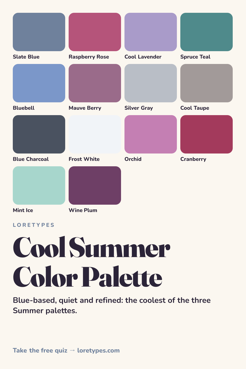
Best colors for Cool Summer
Slate blue, bluebell and spruce teal are the structural colors here, since they carry the blue base that defines the palette. Raspberry rose, cool lavender and mauve berry then bring in the pinks and purples, each leaning toward blue rather than orange.
A helpful way to judge a candidate is to ask whether it looks as if a little blue had been mixed in. A rose with that quality belongs here, while a rose that seems to have a drop of orange or gold in it does not.
Because the contrast is moderate, you can wear two or three of these shades together without the outfit becoming loud. Slate blue with mauve berry and silver gray is an example that feels cohesive and still has some variety.
Cool Summer neutrals
The neutrals lean cool and slightly silvery: silver gray, cool taupe, blue charcoal and frost white. They give a clean, understated base. Blue charcoal is particularly useful, since it does what black does in other palettes but with less severity.
Pure warm neutrals such as camel and cream tend to pull the palette off balance. If you need something that reads like a brown, look for a cool taupe with a gray or rosy cast.
Cool Summer accent colors
Accents are the richer end of the cool palette: orchid, cranberry, mint ice and wine plum. Cranberry and wine plum are the most dramatic, working well as a scarf, a lip or cheek shade, or a single piece of jewelry. Mint ice offers a light, cooling contrast.
Keep these in the role of a highlight. A single accent in an otherwise slate and silver outfit has far more presence than three at once.
Using Cool Summer colors day to day
Cool Summer is easy to wear in business and city settings because its neutrals are naturally professional. A blue charcoal blazer, a frost white shirt and silver gray trousers form a base, and a raspberry rose or slate blue piece completes the picture. Weekend versions replace the blazer with a lavender knit and keep the same trousers.
The main habit to learn is to keep warmth at arm's length. A warm beige bag or an orange scarf will stand out immediately in this palette, while a mauve or silver version fits right in. When shopping, hold the item against a known cool piece, such as a slate sweater, and see whether the two feel related or mismatched.
Colors to use sparingly
Warm and strongly saturated colors work against the cool, tempered character of this palette. Substitutes are listed so you can keep the idea without the clash.
- Orange. A warm, saturated orange has no blue in it and dominates quickly. Cranberry or raspberry rose covers the energetic role in a cool way.
- Golden Yellow. Yellow with a golden cast looks out of key beside slate and lavender. Mint ice provides a light, fresh contrast instead.
- Rust Brown. An earthy red-brown turns the palette muddy. Wine plum or cool taupe offers depth without the orange.
- Cream. Yellow-leaning cream reads dingy beside silver tones. Frost white keeps the lightness without the warmth.
Cool Summer color combinations
Cool combinations are most convincing when they share a blue base. These examples describe families so you can match to your own pieces.
Wardrobe
A slate blue sweater, silver gray trousers and a raspberry rose scarf is a simple, balanced trio. For a formal day, trade the sweater for a blue charcoal blazer.
Accessories
Silver or white-gold-toned metal, a cool taupe bag and a lavender or mauve scarf continue the theme. Pearl-like finishes look especially natural.
Makeup colors
Search for rose, raspberry, berry and cool mauve families in satin or soft matte finishes. The key is that the color names suggest blue or pink, not coral or peach.
Home and desk
Frost white walls, a slate blue chair and a wine plum cushion create a calm, tailored room. A spruce teal plant pot adds depth.
Cool Summer vs Soft Summer and Cool Winter
| Aspect | Cool Summer | Soft Summer | Cool Winter |
|---|---|---|---|
| Temperature | Strongly cool; blue base | Cool-leaning; softer and grayer | Strongly cool; icy and sharper |
| Clarity | Gently muted | Heavily muted; dusty | Clear and crisp |
| Contrast | Moderate | Low | Medium-high to high |
| Typical neutral | Silver gray, cool taupe, blue charcoal | Stone gray, mushroom, soft charcoal | Steel gray, pure white, black |
| Common mix-up | A rose that turns peachy feels warm | A slate that turns bright feels loud | A navy that turns dusty feels dull |
Soft Summer is the neighbor with the same quiet feeling but less blue and more gray. Where Cool Summer would choose slate blue and raspberry rose, Soft Summer would choose gray-green and dusty rose. If your favorite colors seem clearly blue-based, Cool Summer is the better guide, and if they seem blurred and smoky, Soft Summer is closer.
Cool Winter shares the cool base but pushes it crisper and darker. Cool Winter loves cobalt and true pink, while Cool Summer prefers their softened versions. A simple check is to compare a cobalt item and a slate item against your own favorites and see which feels more at ease.
A small experiment with Cool Summer colors
Take a blue-gray piece and a berry-colored piece and place them side by side in daylight. Do they seem to belong together? Next, replace the berry piece with an orange or camel one and watch how the pairing changes.
Finish by testing a silver item and a gold item beside the blue-gray piece. Keep notes about which combination you found easier to look at. Small comparisons like these are more helpful than any label.
This site's quiz works from your palette preferences, not from a photo analysis. This quiz explores palette preferences. It does not measure your skin tone or physical features, and its result is a starting point for trying colors you enjoy.
Find my starting palette →Cool Summer color palette FAQ
What is the Cool Summer color palette?
It is a set of blue-based, softly muted colors from the Summer family, including slate blue, raspberry rose, cool lavender and spruce teal. It is the coolest of the three Summer subtypes, with moderate contrast and a silvery, refined feel.
What are the best colors for Cool Summer?
Slate blue, raspberry rose, cool lavender, spruce teal, bluebell and mauve berry are the main shades. Silver gray, cool taupe, blue charcoal and frost white are neutrals, while orchid, cranberry, mint ice and wine plum work as accents.
What colors should Cool Summer avoid?
Warm and golden shades, such as orange, golden yellow, rust brown and cream, usually clash with a blue-based palette. They are not banned; keep them tiny, or use a cooler relative like cranberry, mint ice or cool taupe.
What is the difference between Cool Summer and Soft Summer?
Both are Summer palettes. Cool Summer has a clearer blue base, with slate, raspberry and lavender, while Soft Summer is grayer and more blended, with dusty rose and gray-green. Look at whether your favorite shades look blue or smoky.
Can the Loretypes quiz suggest Cool Summer?
It can offer Cool Summer as a starting point if your answers prefer cool, softly muted, moderate-contrast combinations. The quiz uses stated palette preferences and no photos or physical features, so the result is a palette to experiment with.
More color season palettes
- Summer color season
- Soft Autumn color palette
- Soft Summer color palette
- Warm Spring color palette
- Bright Spring color palette
- Deep Winter color palette
- Deep Autumn color palette
- Light Spring color palette
- Light Summer color palette
- Warm Autumn color palette
- Cool Winter color palette
- Bright Winter color palette
- 16 seasonal color analysis